
Related Blogs
June 28, 2019 | Michael Reilly
Investors spend too much time thinking the only way to get an edge or outperform the markets is to know what’s happening in the equity markets.
In fact, they spend so much time and energy, that they often overlook the biggest and most important market in the world – the bond market.
Want to know what the pros are thinking? Keep a close eye on what happens in the bond market.
See, bonds are where the big boys play – these are the guys that can tip the scales of any market in the world.
Every cryptocurrency in the world can go to zero and no one with any money will care. All those pot stocks can drop to zero tomorrow and it won’t matter.
Crypto and pot stocks are the “cool new shiny thing” in the equity markets, desperately trying to get your attention and your investment capital – but the institutions are too big to play in the little kid sandbox.
Again, if you want to know how real money is flowing in and out of real assets (and you should), you need to watch the biggest market of them all: Bonds.
This week, we’ll dive into two charts that can telegraph the future direction of the stock market.
But first, here’s what you need to understand:
When institutional money wants to be aggressive, they position themselves into riskier, higher yielding junk bonds at a faster rate than they do into more conservative, lower yielding U.S. Treasury Bonds.
On the other hand, if the institutional money – the “smart money”, is concerned about future economic/market stress, they’ll get more defensive – the result, money will begin to flow into Treasuries at a much faster rate than into “junk” bonds.
It’s a classic case of risk on, risk off. And unless equity investors are watching these bond ratios, they often don’t see the risk until it’s too late.
Our first chart compares the iShares High Yield Corporate Bond ETF (HYG) to the iShares 20 Year Treasury Bond ETF (TLT).
When the line chart is rising, it’s indicative of money flowing into more aggressive, high yield bonds faster than into lower risk 20 Treasuries (TLT).
A rising line is considered risk on, while a falling line can be a warning sign that institutional money is moving to safer pastures.
(Click any image to enlarge)
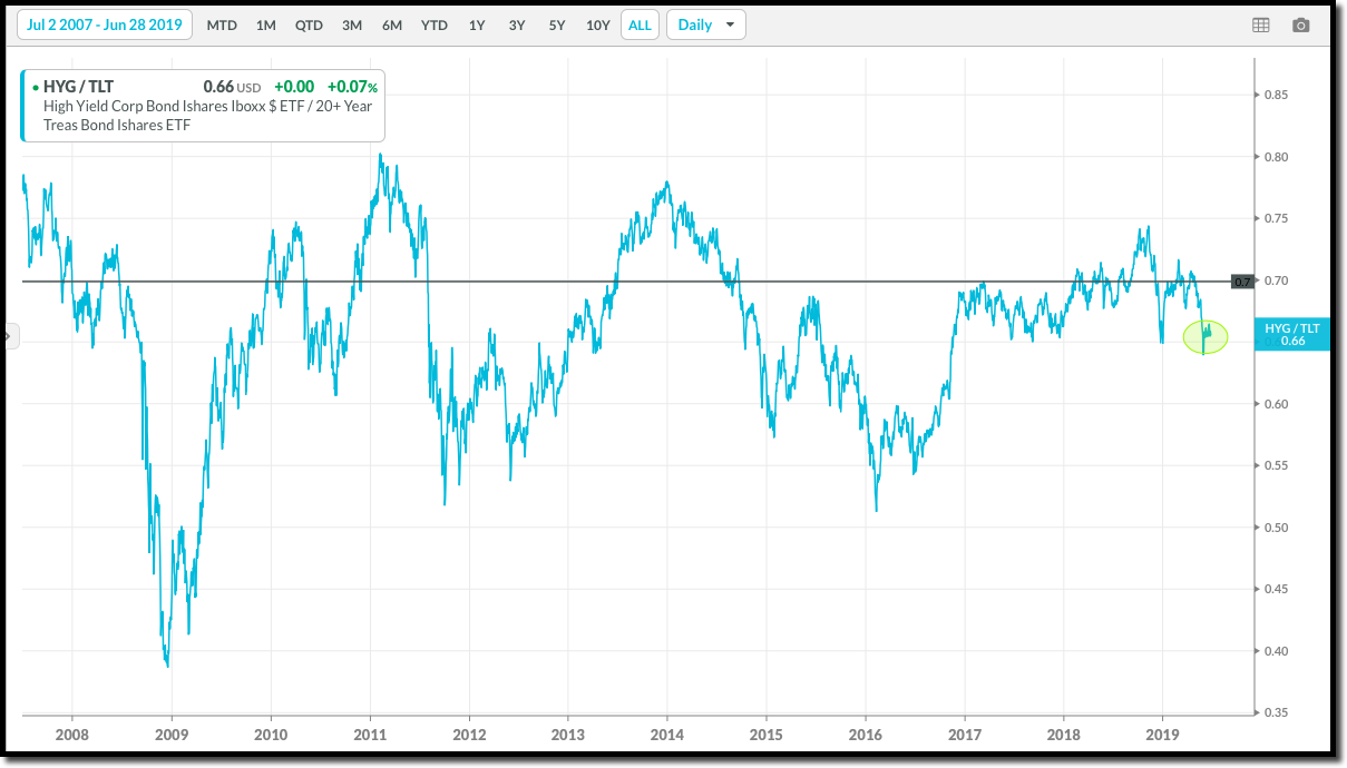
Chart #2 shows the correlation between this relationship (HYG:TLT) and the S&P 500 index since July 2, 2007.
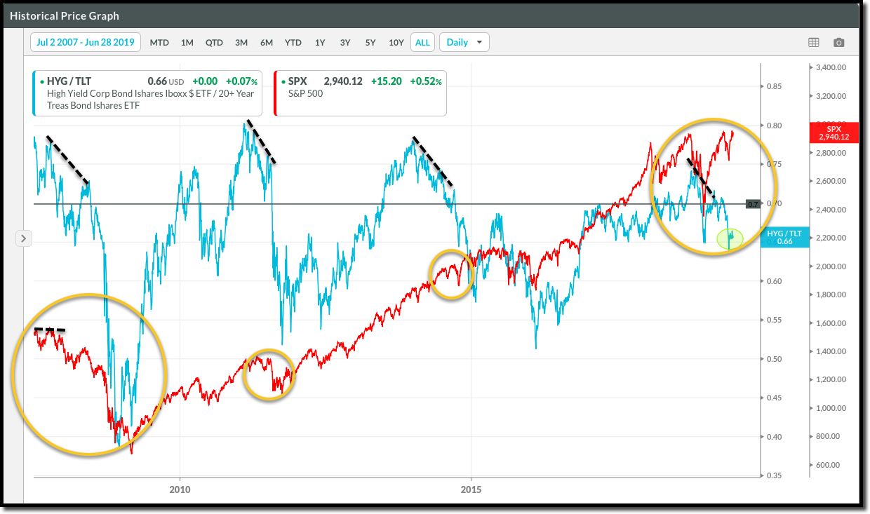
Notice to the far left of the chart (circled) how the S&P 500 was in record territory into October of 2007, while the High Yield vs Treasuries ratio turned negative?
This decline in the ratio of HYG:TLT preceded the collapse in stocks in 2008.
We saw a similar divergence in the Spring of 2011 before a severe correction, and once again before the 2015 correction:
There were also warning signs of possible weakness for equity markets seen when the bond market shifted in early October 2018 – prior to the selloff we saw later that year.
Taking this concept one step further, we can make a similar comparison between Junk Bonds and Investment Grade Corporate Bonds.
Like the ratio above, if there is risk appetite at the institutional level, you’ll see more money flow into riskier high yield (junk) bonds than you will into safer investment grade bonds.
If there is stress out there, you’ll likely see it here, in the ratio between High Yield Bonds vs Investment Grade Bond.

The ratio of money flowing faster into “risk on”, high yield funds assets quickly turned to “risk off” as the big institutional players shifted funds to more conservative corporate bond investments in October – sending the blue ratio line downward.
This should have been a flashing neon sign to investors – as it was a prelude to a painful sell-off that followed in equity markets.
Although there are a lot of ways to measure stress in credit, the two charts above can provide a glimpse into what the big money players are thinking and doing as they deploy their capital – giving individual investors an opportunity to adjust portfolios as needed.
One of our core investment strategies at Rowe Wealth Management involves tracking the flow of this “big money” into the different market sectors. After all, this money is often one of the biggest components of what’s moving the market, and being able to follow it can be a powerful tool.
If you’re interested in more information on other tools of technical analysis and relative strength investing, feel free to email us at info@rowewealth.com.
We also offer 100% portfolio evaluations to qualified investors with a portfolio of at least $500,000. In just a few minutes we can run your existing investments through a series of tests that will give you a very clear picture of both the overall strength of the securities in your portfolio and the amount of risk they carry. Put simply, you’ll see exactly how much you stand to gain or lose over the next six months, plus recommendations for changes you can make to simultaneously reduce risk and increase potential gains.
Click here to see a list of available appointment times now. These are free, and can be conducted online or over the phone.
As always, invest wisely.
Mike Reilly
Tags

Get Our FREE Guide
How to Find the Best Advisor for You
Learn how to choose an advisor that has your best interests in mind. You'll also be subscribed to ADAPT, Avalon’s free newsletter with updates on our strongest performing investment models and market insights from a responsible money management perspective.
