
Related Blogs
August 18, 2021 | Michael Reilly
 You might be flying blind in the stock market if you miss this bond market signal…
Today, you’re going to learn about what may be the single most important “cross-asset ratio” we track. Don’t worry about the wonky terminology. Cross-asset ratio just means we are looking at the price of two different things in relation to one another. Like stocks vs bonds.
Investing is pretty simple unless you make it complex. Unfortunately, some people fall into the trap of checking hundreds of technical indicators. But technical indicators are like phone apps – there are millions of them. But you really only need a few simple ones for your quality of life to change dramatically.
This particular “ratio” that I’m hoping you’ll use from this day forward, has just one job: To illustrate if stocks are stronger than bonds or bonds are stronger than stocks.
Simple enough, huh?
Investors armed with this insight immediately have that edge over investors still relying on stock market indexes for directional bias.
The best way to visualize the relationship between stocks and bonds is via a relative strength ratio chart ($SPX: AGG).
You can find it for yourself by going to nearly any charting service (try stockcharts.com) and entering $SPX: AGG into the same symbol field you’d enter any stock ticker into.
In fact, go ahead and try that now and come back and keep reading… I’ll wait here.
SPX or $SPX represents the S&P 500 index. As you probably know, this is the most popular stock market benchmark.
AGG is the most popular “bonds” benchmark. But today, we’ll get a little more specific than comparing stocks to just “bonds”. Instead, we’ll compare stocks to long-term Treasury bonds.
So instead of $SPX: AGG, which is “stocks versus bonds”, let’s check out $SPX: TLT, which is stocks versus Treasury bonds. TLT is actually an exchange-traded fund. It acts as a bond proxy for 20-year Treasuries.
Comparing the stock market ($SPX) to 20-year U.S. Treasury bonds (TLT) is a classic risk analysis.
What does this ratio tell us?
Simply put, it illustrates which asset class is stronger on a relative basis. Stocks or Treasury Bonds. Table the emotion, the eye-catching headlines, and fear-mongering and apply an unemotional, unbiased, and time-tested process that even the most novice of investors can get their head around.
Without getting into the weeds, when the line of this ratio chart is moving up, strength favors growth over defense, meaning investors are often rewarded with higher profits by owning stocks rather than bonds.
Conversely, when the line chart is moving down, stocks are no longer stronger than bonds – said another way, the falling line indicates it may be time to play defense and consider protecting assets, rather than taking on additional risk assets (stocks).
It’s that simple.
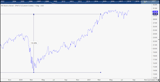
Here it is at work: The cross-asset ratio chart ($SPX: TLT) comparing the strength of stocks to the strength of bonds.
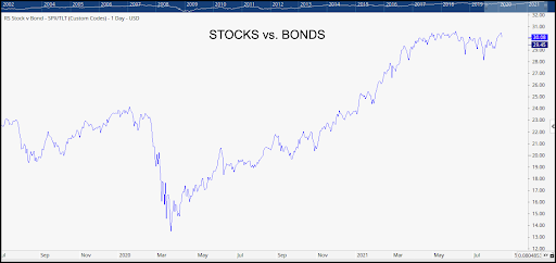
Anyone looking at the chart above can see that since March of 2020 the line was moving sharply higher – illustrating the strength in equities over bonds. Investors could have applied this information by tilting their portfolios to favor stocks over bonds (regardless of the scary headlines).
If they had, they were rewarded with some eye-popping returns of over 118% for the S&P 500, between March 23, 2020, and mid-March 2021.
But here’s where it gets a little more tricky – 2021 is not anything like 2020.
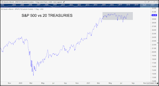
What a mess! Since March this ratio has been consolidating in a sideways range. It’s been a choppy, range-bound mess for almost six months, with no clear breakdown or breakout for either stocks or bonds.
I don’t show it here, but this range-bound mess hasn’t been isolated to just stocks of the S&P, you can pull up almost any stock index from around the globe and see similar patterns.
For investors, markets like this are frustrating and difficult for even the most seasoned traders – as stocks drift sideways for months at a time.
But, let’s zoom in and see if anything is changing.
Here’s a closer look using daily price action since August 4, 2021.
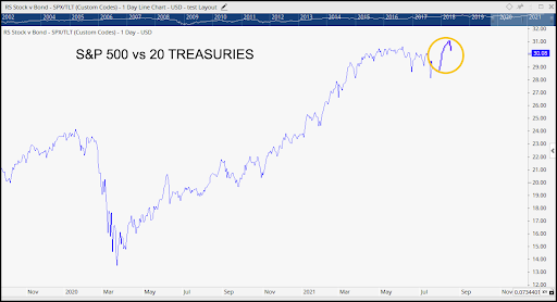
The ratio is making some noise with a short-term move to the upside and that’s got my attention.
Because IF – and only IF, stocks can stage a solid breakout here, it would be one for the bulls, giving us a heads-up that equities are taking the lead.
And if we see that, we can use that data to shift more heavily into stocks and away from defensive assets, like bonds.
But let’s not get ahead of ourselves – we aren’t there yet. A breakdown in this ratio would mean stocks still have some work to do before we’d want to overweight equities.
We’ll be sure to keep you up to speed if we see a full-on breakout in this important cross-asset ratio.
Stay tuned for more… until then, invest wisely.

PS: It’s that time of the year again. We are once again opening the doors to new investors who have investment portfolios valued over $500,000. If you’d like to schedule a free 1-hour consultation to review your portfolio. Click here to schedule a free consultation.
Through relative strength analysis, we uncover the strongest asset classes, sectors, and industry groups that are in uptrends and showing the potential for continued profits.
As an investor, your success and profits are often tied to your ability to adapt to ever-changing market conditions – and to the asset classes and sectors attracting the most institutional demand.
And that’s what ADAPT Weekly has set out to do – highlight market changes and give investors like you an edge, and the opportunity to profit tactically from what’s working and what’s not.
Tags

Get Our FREE Guide
How to Find the Best Advisor for You
Learn how to choose an advisor that has your best interests in mind. You'll also be subscribed to ADAPT, Avalon’s free newsletter with updates on our strongest performing investment models and market insights from a responsible money management perspective.
