
Related Blogs
February 27, 2023 | Avalon Team
Every day more and more of the news implies that equity markets around the world have gotten ahead of themselves – that the fundamentals don’t support the surge in price.
Here in the U.S., the message has been pretty consistent.
As long as employment remains at current levels and inflation remains stubborn, we can assume the Fed will continue its “higher for longer” mantra.
That means the Fed runs the risk of breaking something.
And investors are getting nervous.
So let’s take a step back and look at three charts that will go a long way in telling you when it’s time to evaluate the risk-on play.
But first, let me set the stage.
Last week I told you that February is a notoriously volatile month, and this year is no different.
It’s straightforward to spot in the seasonality chart below.
What you can see is that dating back to the 1950s, February is a chronic underperformer.
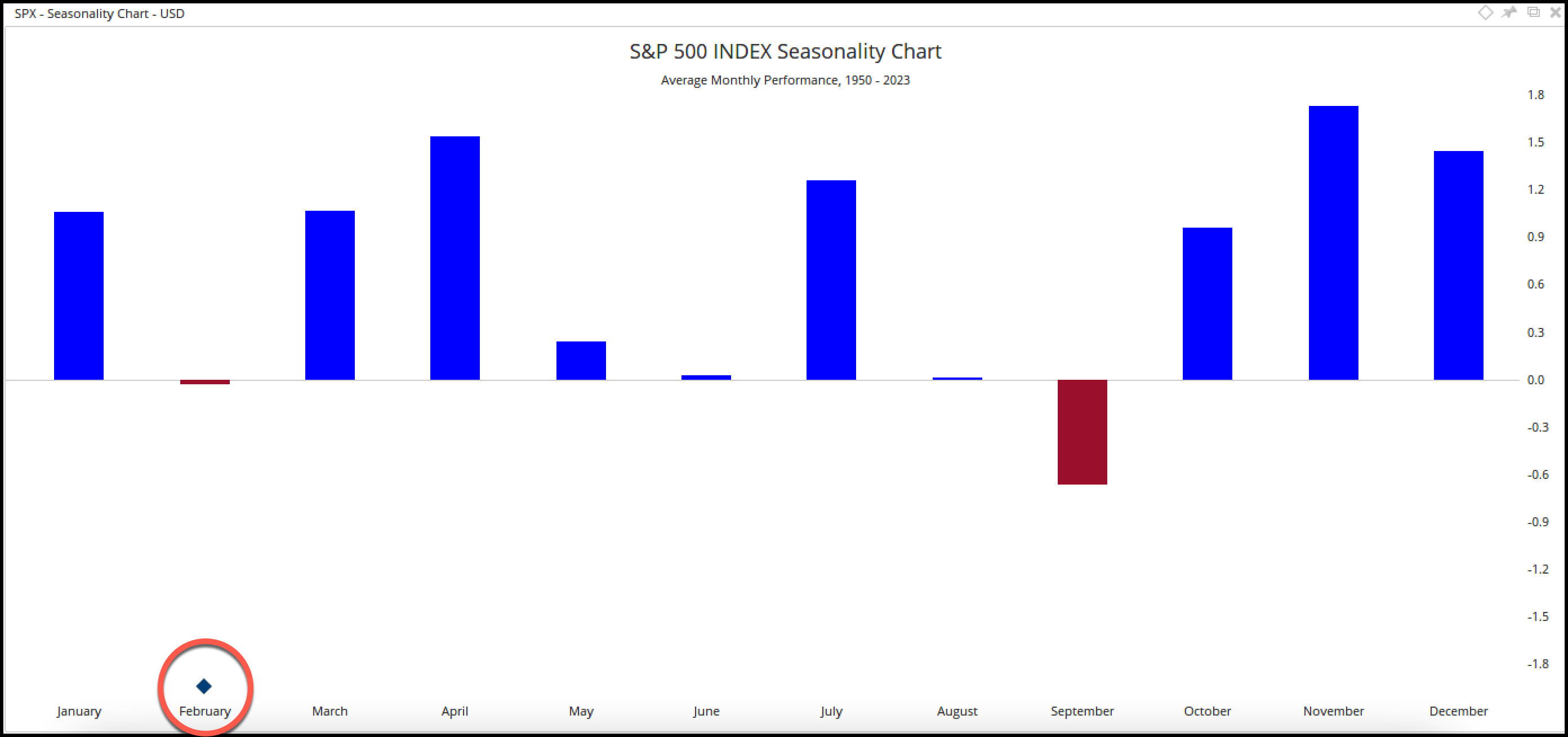
February 2023 is doing exactly what we’d expect – nothing!
So what to take from it?
Just that, the volatility and lower prices are normal for this month and aren’t a reason for outright panic.
No fun, but to be expected.
On a more positive note, the other seasonality chart below is the Presidential cycle.
During the mid-term cycle, stocks historically struggle and tend to grind sideways.
True to form, that’s what they did during this last midterm cycle as well (red line).
But 2023 marks the strongest year of the four-year cycle (highlighted).
Although we’re very early into the pre-election year, markets have done what they tend to do – rise.
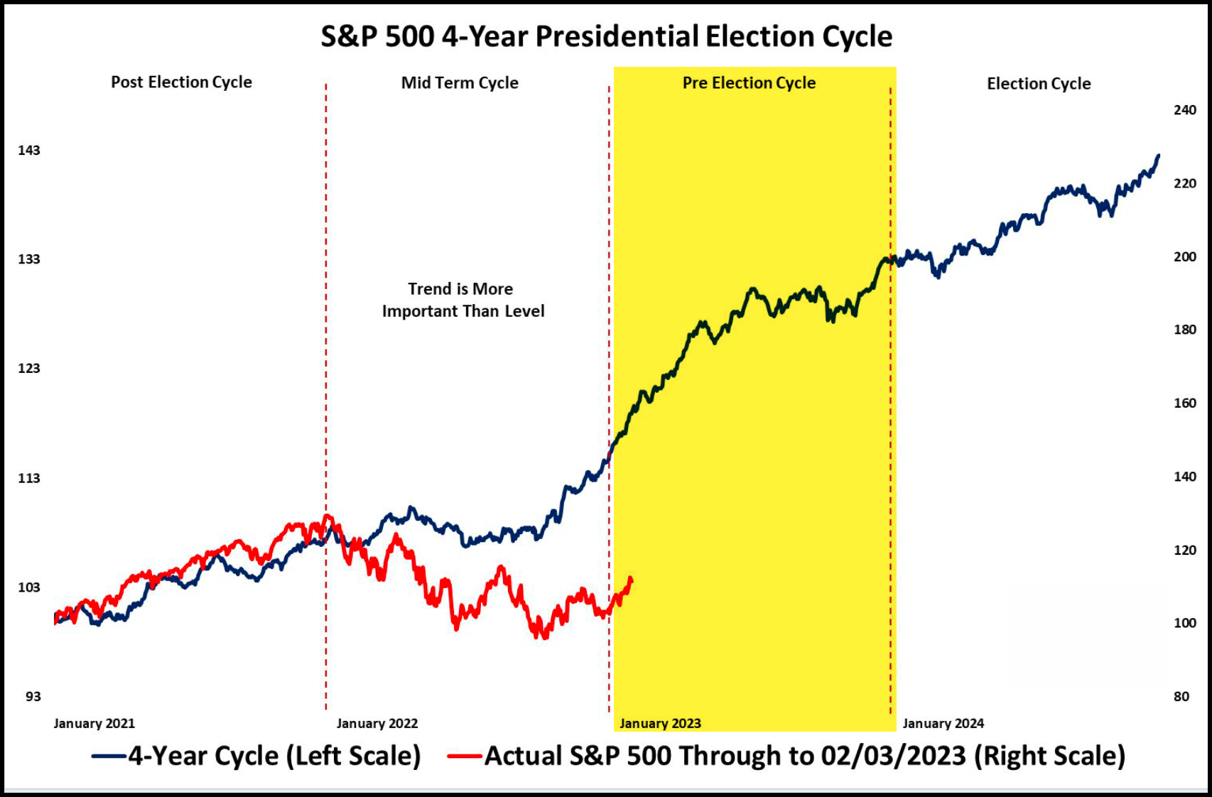
These seasonality patterns are great. However, I find more value in these seasonality charts when they don’t do what we expect them to do.
So, if for example, the red line (S&P 500, 2023) begins to reverse significantly lower from current levels or doesn’t follow the historical trend line higher (blue) that will be meaningful information!
And that is my segway into the three critical charts to watch this quarter…
The first is the Value Line Geometric Index.
This one gets overlooked, but is a helpful gauge of the average stock.
Unlike the S&P 500 index or the DJIA, the Value Line Geometric Index is a much broader stock market index that is equally weighted and was created to track the median move in stock prices.
So this one is my go-to index to see what the average stock out there is doing.
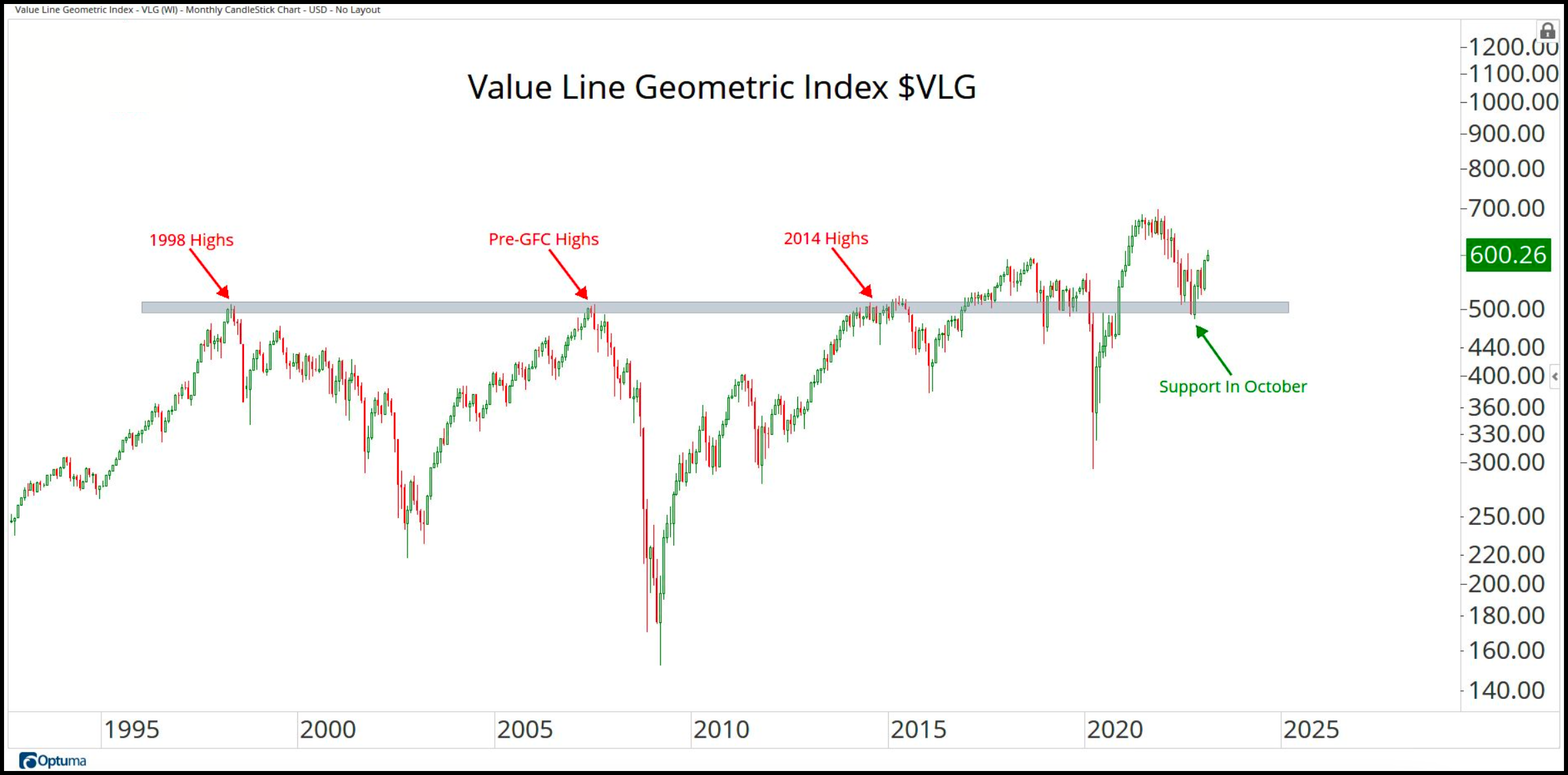
Do you see the previous highs of 1998, the Pre-Great Financial Crisis, and 2014?
Each of these areas proved to be formidable resistance to stock prices. There are more than 20 years of history right there (resistance).
If you look to the right of the chart – see how that same level became support! That’s a big deal. So that area is an important one to watch.
And as long as the Value Line Geometric index can stay above that previous area of resistance turned support, I have to ask myself, how much trouble can markets be in?
Any meaningful and sustained break below the October 2022 low and we’re probably in for some serious trouble for stocks.
Next are Financials.
As long as Financials (using XLF as our proxy) remain above the pre-covid high, the 2018 highs, and pre-GFC highs, we’re probably ok.
Consider some of the companies we’re watching here – JP Morgan, Berkshire Hathaway, Goldman Sachs, BlackRock, and Charles Schwab.
These are some of the big guns of the Financials sector. If they’re doing well, it’s likely that markets in general are relatively healthy.
But again, if Financials break down below these really important levels, all bets are off.
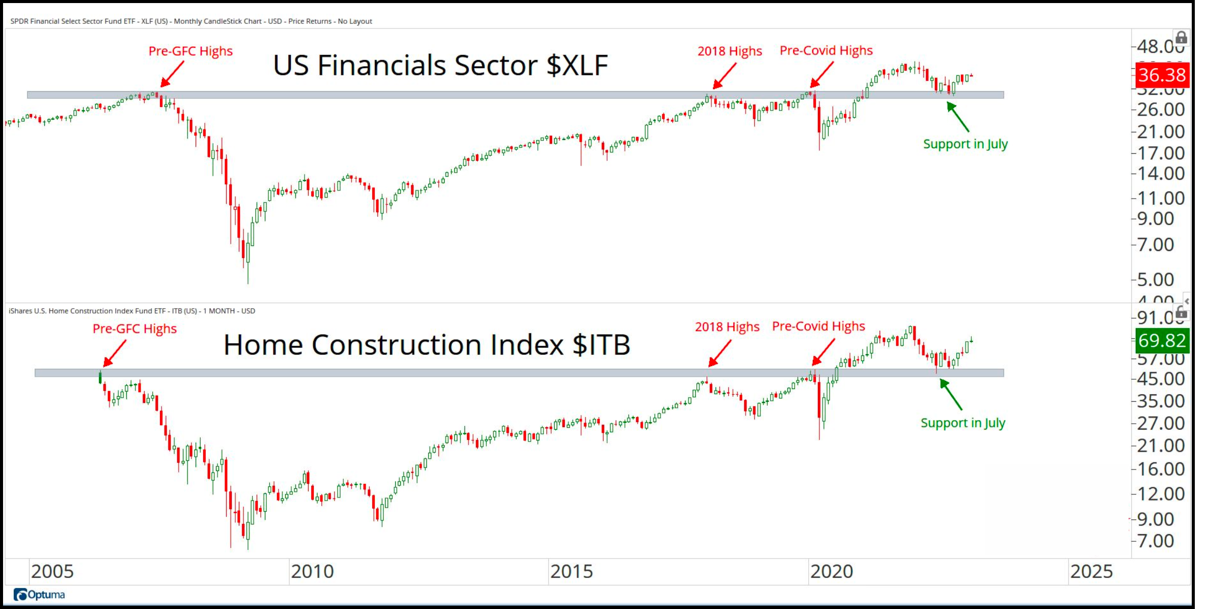
And last, but not least are the Home Builders – specifically, ITB, the Home Construction ETF
This one holds builders, DR Horton, Lennar Corp, Toll Brothers and Sherwin Williams, Home Depot, and Lowe’s.
If ITB is doing well, it’s in an environment that’s conducive to economic growth.
If you look back, ITB had negative returns when the economy and markets struggled – 2007/2008, 2011, and 2018, and performed well in years of economic growth.
So it’s a bit of a bellwether for economic activity. And just like VLG and XLF, if the homies can remain above prior resistance turned support, then I have to wonder if everything we’re hearing about global recession is just a lot of hype.
Now, to be clear, I’m not implying that it’s all hype. I don’t know what’s going to happen tomorrow, never mind next month.
And as I’ve said before, it’s reasonable to assume that if the Fed continues raising rates for an extended period and continues to remove liquidity from the economy, then recession concerns are warranted.
However, we’ll get our answers to the recession question from price charts just like the ones I’ve shared here today.
Price has no bias. Price is price. Follow the charts, not the headlines.
If you have any questions or have been considering hiring an advisor, then schedule a free consultation with one of our advisors today. There’s no risk or obligation—let's just talk.
Tags

Free Guide: How to Find the Best Advisor for You
Get our absolutely free guide that covers different types of advisory services you'll encounter, differences between RIAs and broker-dealers, questions you’ll want to ask when interviewing advisors, and data any good financial advisor should know about you and your portfolio.
