
Related Blogs
April 19, 2021 | Michael Reilly
 This market indicator is flashing its highest reading in 8 years.
I’m talking about market breadth.
Market breadth indicators analyze the number of stocks advancing relative to those that are declining in a given index or on a stock exchange (such as the New York Stock Exchange or S&P 500 or NASDAQ).
Positive market breadth occurs when more stocks are advancing than are declining. This suggests that the bulls are in control of the market’s momentum and helps confirm a price rise in the index. Conversely, a disproportionate number of declining securities is used to confirm bearish momentum and a downside move in the stock index.
Traders use market breadth indicators to assess the overall health of the market/index. Market breadth indicators can sometimes provide early warning signs of a drop in the index, or forecast a coming rise in the index.
You can’t spot breadth simply by watching an index. An index can continue moving to all-time highs, but, if under the surface, fewer and fewer stocks are showing up and contributing to that move – well, that move is suspect and likely to fail.
And that’s exactly what happened in January of 2020, prior to February’s historic crash. Many investors got sucked in, relying on news that the S&P 500 index was hitting fresh new all-time highs.
Investors did as most investors do, they allowed the emotion of the moment to rule their decision-making – it was classic FOMO (fear of missing out).
If instead, they had relied on breadth – they would have been alerted to problems for the S&P.
Now, safe to say, very few, if anyone, could have predicted COVIDs harsh impact on equity markets in February of 2020. But what was clear, in January ‘20, was that equity markets were running out of steam – with fewer and fewer stocks moving higher – this was evident in weakening breadth indicators.
You see, prior to major market peaks, we normally see deterioration in breadth. It makes perfect sense, if more and more stocks, that trade on, say the S&P 500 index, stop participating in a market move and begin to break down to new lows, then at some point the index is going to follow.
That’s what happened early last year. The index was hitting new all-time highs, while behind the scenes, fewer stocks were moving higher.
The only way investors could have spotted this deterioration is if they were paying attention to market breadth – that’s where you were given a heads-up that something was changing.
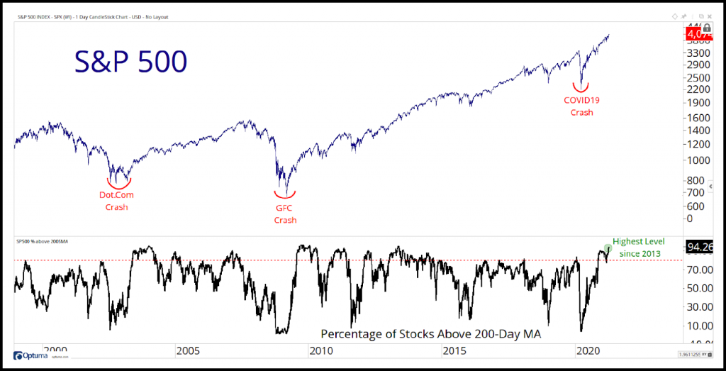
Today – market breadth looks dramatically different. Breadth is off the charts high – which is incredibly supportive of equity markets.
Breadth started to pick up in the second half of last year and hasn’t shown any signs of slowing. We tend to see high breadth readings in the early stages of a new bull market, and these readings are supportive of a structural uptrend for risk assets, in general.
Right now, the percentage of stocks in the S&P 500 above their 200-day moving average hovers at an eye-popping 94% – the highest reading since 2013.
The next chart takes an even deeper dive into breadth, but with a twist. Rather than looking for new highs, the next chart and looks at the percentage of stocks on the S&P 500 moving to new 10 day lows, new 21 day lows, and new 63 day lows.
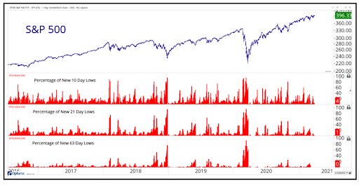
As you can see, the percentage of new lows is virtually non-existent (far right).
So, what does current breadth tell us? Well, for one, you’re not going to see the S&P rollover unless we see more and more stocks begin to hit new lows – which we’re not.
If markets are losing momentum, we’ll see a spike in the new 21-day and 63-day low lists. 21 days is a month’s worth of trading days, while 63 days is a quarter.
And because we don’t yet see spikes at these lower time frames, we consider this bullish information.
If we’re going to see the equity market deteriorate and roll-over, we’ll see it in the short term charts (10 day, 21 day, 63 day) long before we’d expect to see spikes in the new 6 month or 52-week breadth indicators – that’s why I didn’t include those time frame today.
Until we begin to see what’s referred to as “fall days”, which occurs when there’s a spike of new lows, equity markets get a clean bill of health.
International markets have a clean bill of health just like the U.S.
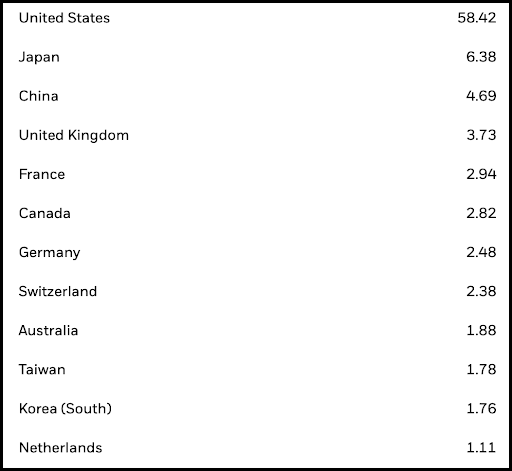
Here’s a chart of the MSCI All Country World Index (ACWI). The ACWI index represents the performance of 23 developed and 27 emerging markets stock markets.
Here’s a partial breakdown of members:
And just as we saw in the breadth analysis of the S&P 500 index, there is a complete lack of evidence pointing to any problems in global equity markets – to the contrary, we continue to see broad-based participation from stocks all over the globe.
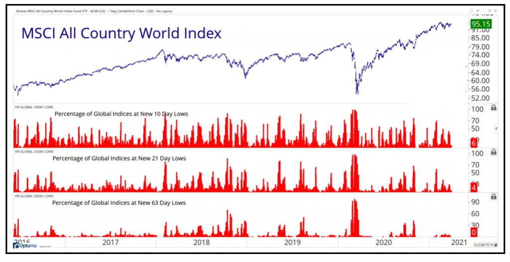
Again, we would expect to see an expansion in the new low lists if global markets were beginning to decline.
To be clear, global markets continue to be in strong uptrends and confirm the current price behavior of their respective indexes.
So the long and short is this, although we may continue to see continued consolidation and choppy markets as we move into the summer months, structurally, equity markets across the globe point to higher prices.
Check back again, as we’ll be keeping a close eye on breadth levels for any clue that something big is on the horizon.
Until next week…
Tags

Get Our FREE Guide
How to Find the Best Advisor for You
Learn how to choose an advisor that has your best interests in mind. You'll also be subscribed to ADAPT, Avalon’s free newsletter with updates on our strongest performing investment models and market insights from a responsible money management perspective.
