
Related Blogs
June 28, 2021 | Michael Reilly

At the risk of sounding redundant, markets today continue to be messy, choppy, and otherwise frustrating for many investors.
That’s been the prevailing theme for months now. And for trend followers, that can lead to frustration. The best way to avoid that frustration is to understand the kind of market you are in and invest (or not) accordingly.
The sideways, choppy, consolidations we are witnessing right now aren’t unusual. As a matter of fact, this is typical year two behavior after big run-ups off prior market lows.
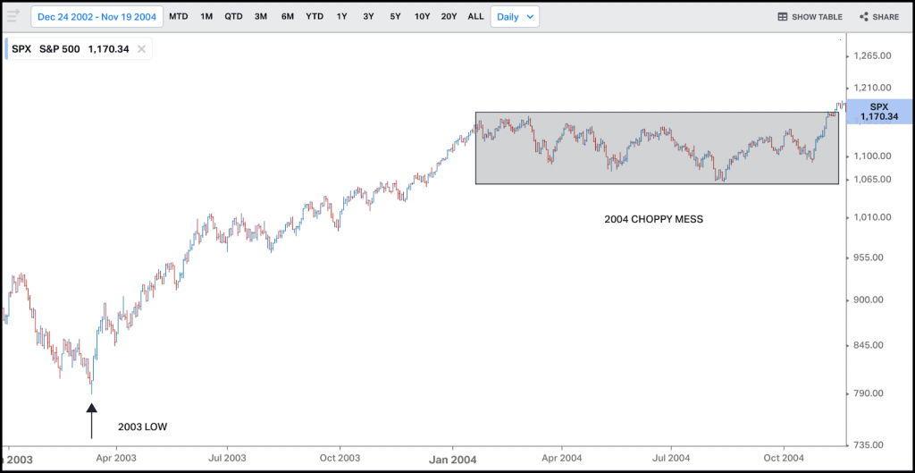
For those of you who missed it the first time, here’s a quick trip down memory lane. We saw sideways, choppy, trendless markets in 2004, following the 2000 Tech wreck and subsequent rebound in 2003.
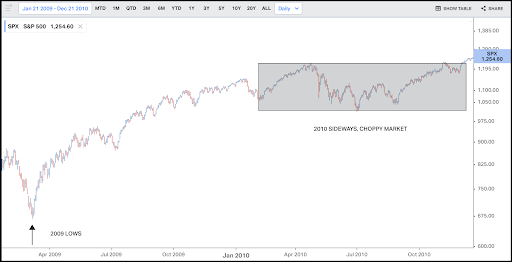
More recently, investors experienced similar frustrations navigating markets in 2010, following the Financial Crisis and 2009 rebound.
2004:
2010:
2021:
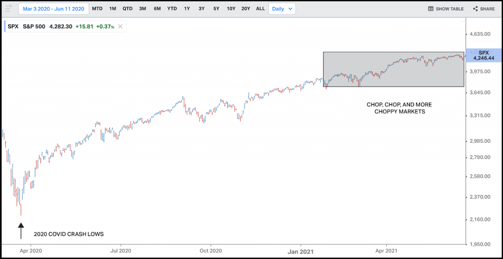
These charts look a lot alike to me. Seems pretty normal, albeit frustrating.
The question I’m hearing most often is “how long will it last”?
The short answer is – we don’t know, no one does. However, what I do know is there is a wealth of information to be had if you know where to look.
So today, we’re going to take a close look at a few of the charts we’re watching – looking for any signs that indicate markets are leaning heavily in one direction or the other; risk-is on risk-off.
Experience has taught me it isn’t enough to just focus on what’s working. Sometimes, we gain a lot by understanding what isn’t working and what the potential inter-market implications are lurking just beneath the surface – more on that later.
Let’s look at what was working but is no longer. What I’m talking about is Financials.
The financial sector is important for a lot of reasons, not the least of which is that we don’t have sustained bull markets without Financials showing up. They don’t have to lead, but they have to show up.
And right now, we’re keeping an eye on the financial sector to see if they’re trying to make a very quiet exit from the party. That’s no bueno…
A really important chart that we are watching for information right now is that of the U.S. Regional Banking sector.
Here, I’m watching the Regional Bank ETF (KRE). If KRE fails to hold and breaks below the 2018 highs, it could signal trouble ahead – and not just for the sector, but for domestic equity markets in general.
Regional Banks (KRE)
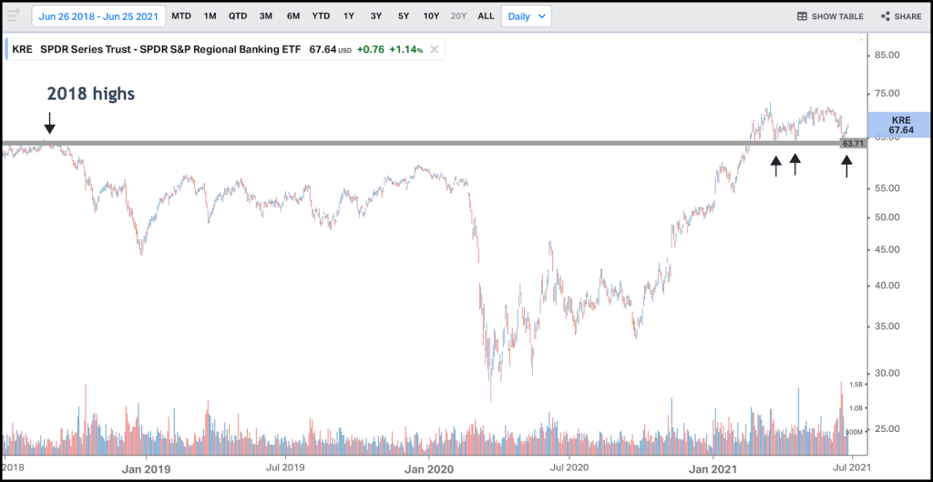
But if KRE can hold here and bounce off those 2018 highs, as they did in Q1 of this year, that would be a feather in the cap for the bulls. We just don’t want to see a break below these levels – because that could be a more ominous sign. Or at best, signaling messy for longer.
So that’s KREs price chart – but how are Regional banks holding up against the broader market. This is when we apply some of my favorite tools – relative strength ratios, used to compare the price movement of one market, sector, or stock against another.
Here we’re looking at a relative strength ratio chart comparing regional banks (KRE) to the broader market – using SPY as our S&P 500 index proxy.
KRE:SPY
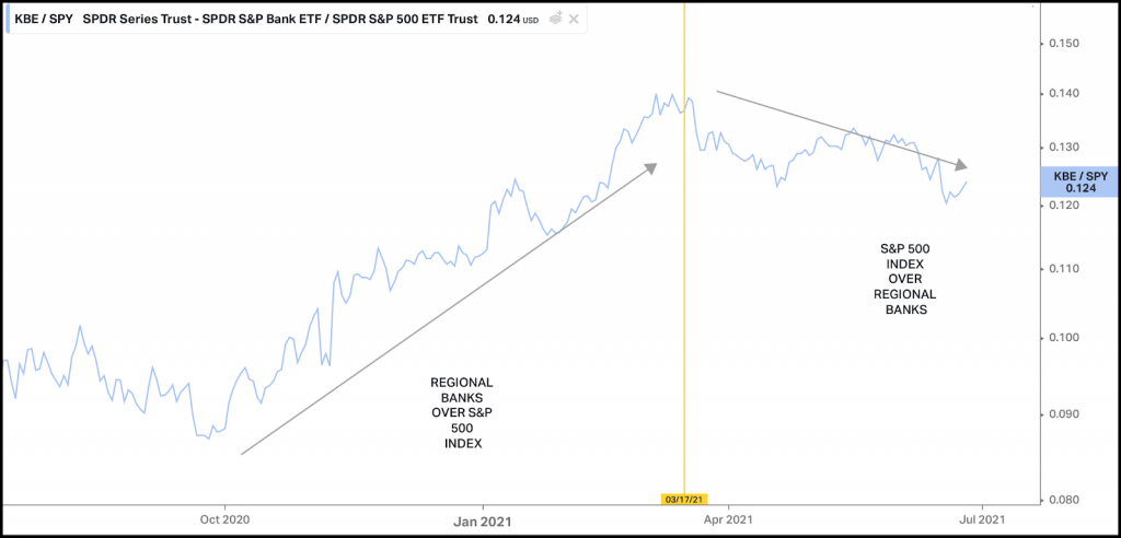
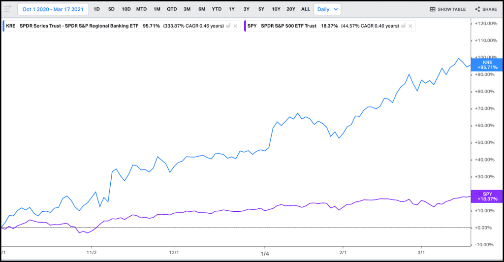
Regional banks showed impressive relative strength in the 4th quarter of 2020 and Q1 2021. And as long time readers have heard me say many times, where there’s relative performance, it usually translates to absolute performance.
And here you can see how Regional Banks smashed the performance of the S&P between October 1, 2020, and the March 17, 2021, relative strength highs. Over this time, KRE gained 95.71% to the S&P 500 (SPY) 18.37% return.
However, that strength has waned – since mid-March ‘21, as the broader S&P index ETF (SPY) has outperformed Regional Banks on both a relative and absolute basis.
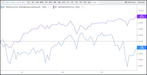
Since March 17, 2021, SPY has gained 8.09% while Regional Banks (KRE) have a negative return of -2.09%.
So that’s the domestic perspective. We’re not just interested in what banks here in the U.S. are doing. This is a global theme. We’re watching European Banks too.
European Financials (EUFN)
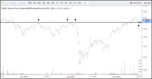
If European Banks (EUFN) can’t hold above former resistance near 20, then International stocks are most likely under pressure.
And if that’s the case, then what does that say about the global growth and reflation trade we keep hearing about? This is what I meant about inter-market implications…
To me, it means that the global growth thesis is probably running into some trouble and maybe the choppy trendless markets continue longer than any of us would like to see.
However, as long as both U.S. and European Banks can hold at these levels, I have to wonder how bad can things really be?
But, if they roll over at these levels, it’s likely happening in an environment where stocks remain under pressure longer. Choppy for longer.
To be clear, that’s not happened yet, but investors want to be aware of what’s happening behind the scenes, at the sector and industry group level, regardless of what we see at the index level.
The S&P 500 index and the DJIA have flirted with all-time highs throughout 2021. But investors should be cautioned that this is a market of stocks, not a stock market. And as such, it’s important to know what stocks are doing and not rely on an index for your investment thesis.
Because the Financial sector has broader market implications and may be signaling a cautious tone, you can bet that we’ll be watching these charts closely for any significant directional move.
Stay tuned for any further developments.
If you find this article interesting or would like to learn more about how Rowe Wealth Management manages money click here to schedule a free consultation.
Until next week, trade safely…
Tags

Get Our FREE Guide
How to Find the Best Advisor for You
Learn how to choose an advisor that has your best interests in mind. You'll also be subscribed to ADAPT, Avalon’s free newsletter with updates on our strongest performing investment models and market insights from a responsible money management perspective.
