Related Blogs
November 1, 2022 | Avalon Team
Have you noticed that the financial media can’t get enough Doom & Gloom?
Every headline is another big loser. Another miss. Another crash.
The media knows what buttons to push – they’re masters at it.
And they’re up to their old tricks again… I hope you’re not falling for it.
Let’s break the cycle starting today!
The first thing to do is stop reading all the eye-popping headlines!
I know it’s hard not to look, but they’re not helping you.
I promise you, not one headline will help you make or save a penny!
It’s best to focus on what can actually help you in this market – or in any market for that matter.
For us, it comes down to just two simple things: Price and Relative Strength.
Once you understand these two elements, you’re already on your way to greater success.
Today, I’m going to show you how we apply this in real time, so let’s dig in…
Let’s start with what many of us probably know: Some of the biggest names on the planet are getting smoked.
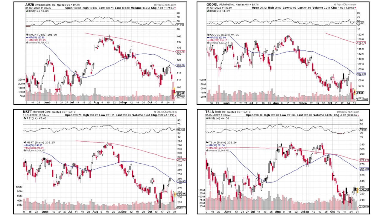
It’s easy to see in the price charts below.
Why do the charts tell us a lot about these four behemoths? Well, for starters, all four stocks are in obvious downtrends.
Their 50-day and 200-day moving averages are sloping down – never a good sign for price.
And the price isn’t even near their respective 50-day moving averages, never mind the longer-term 200-day moving average. Not one. Yuck….
These are not the kind of charts we’d recommend from the long side. Textbook weakness.
But who cares?! You shouldn’t. And do you want to know why?
Because mega-cap/large-cap growth stocks like Google, Microsoft, Tesla, and Amazon are not the only stocks you can buy.
I know they’ve been the big winners over the last 20 years while we lived in an artificially low-interest rate environment.
But that’s not the world we live in today, is it?
This is a market of stocks – not a stock market. Let that sink in.
If we can agree (based on our small sample above) that some of the biggest stocks in the world are not in uptrends, and therefore, we don’t want to own them, then the next logical question is:
Where should investors look?
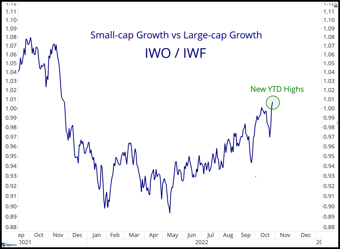
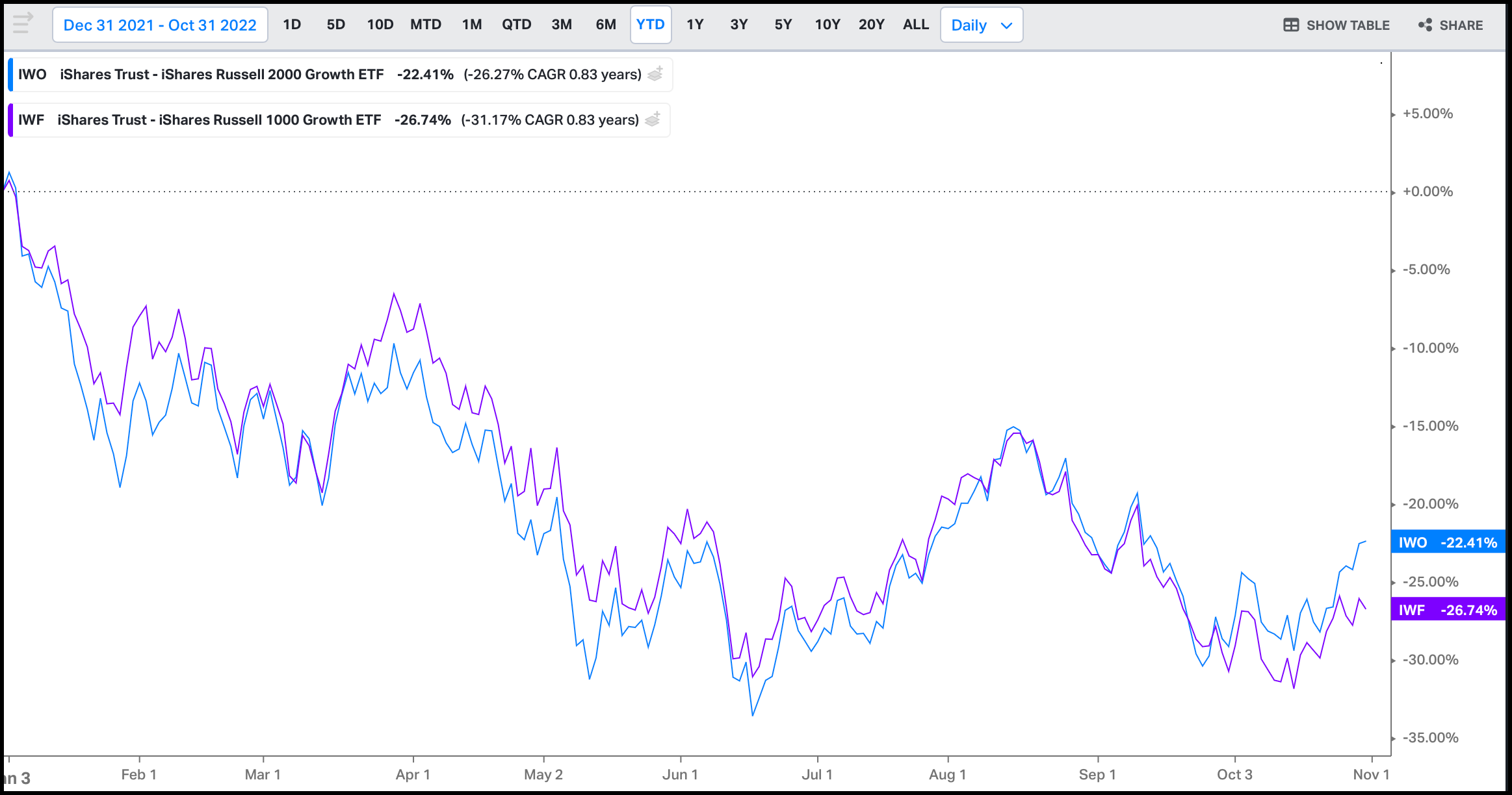
This is where Relative Strength comes in handy. For example, did you know small-cap growth stocks are making year-to-date highs on a relative basis versus large-cap growth stocks?
See for yourself.
That blue squiggly line is the ratio comparing small-cap growth stocks (IWO) to large-cap growth stocks (IWF).
When the line is rising, small-cap stocks are outperforming large-cap stocks (as they are now). When it’s falling, small-cap stocks are underperforming large-cap stocks.
Let’s dig even deeper…
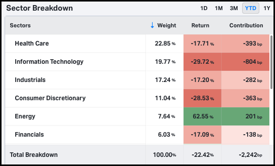
Here is the sector breakdown of IWO (the small-cap growth ETF that I used in our Relative Strength comparison to large caps).
IWO holds 7.6% Energy, 6.0% Financials, and larger stakes in both Healthcare and Industrials than the large-cap growth ETF (IWF) holds.
That’s important because these sectors have been outperformers on both a Relative Strength and an absolute basis this year.
Oh, and IWO has half the exposure to Tech as its large-cap cousin (IWF). And Technology is one of the worst-performing sectors of 2022.
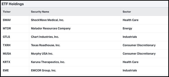
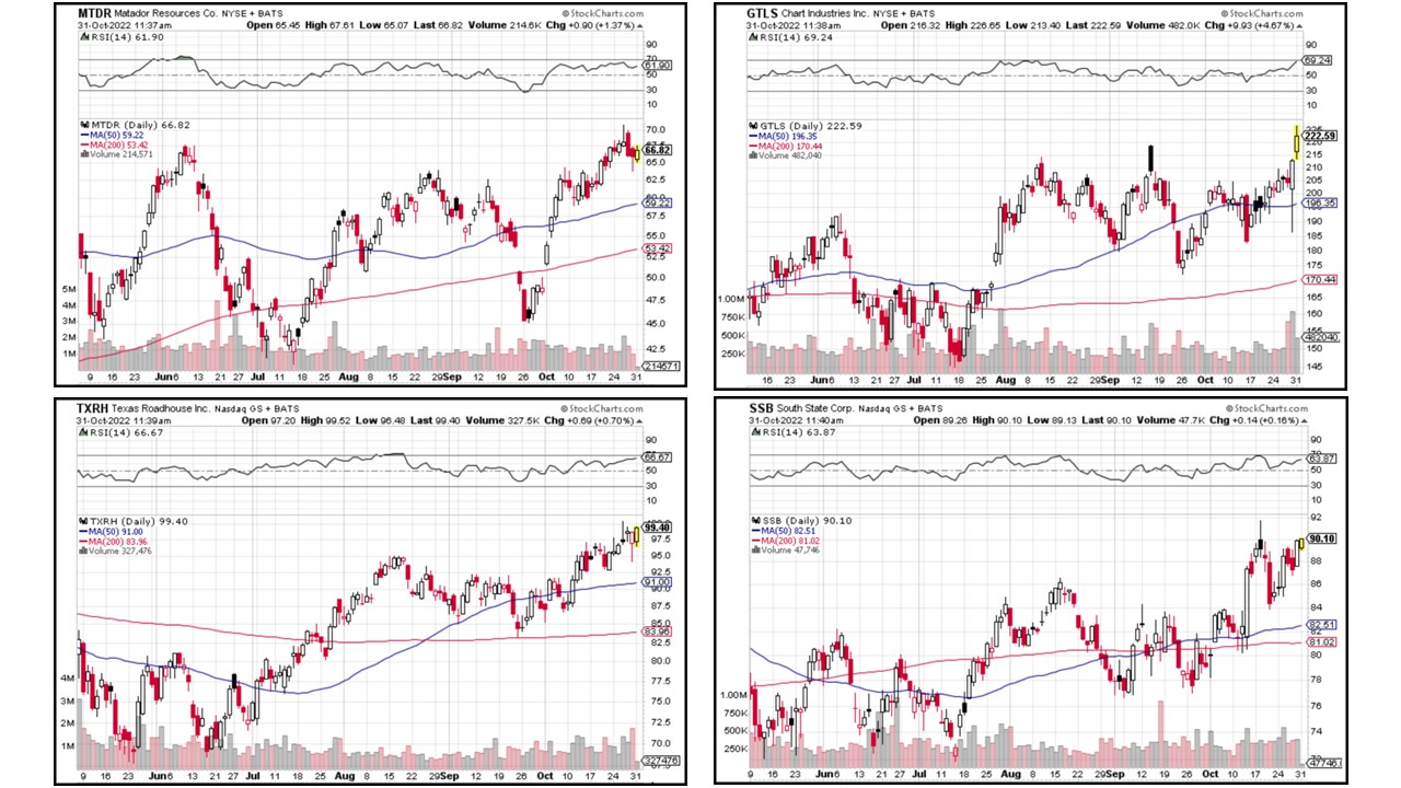
Here are some of IWO’s holdings:
The names alone may not mean anything, so take a look at the price charts from a few names above.
Take a minute and compare these four charts to the charts of MSFT, AMZN, TSLA, and GOOGL.
See the difference? These charts are in uptrends!
Higher highs with prices above their respective 50- and 200-day moving averages. Much nicer.
Here’s a disclaimer: I’m not suggesting you run out and buy these four stocks.
I’m simply making a point that while some stocks in a market of stocks are moving lower (large-cap), others are holding up better, or even moving higher (small-caps).
Two very different trends within the same market that we clearly identified using a simple comparison of Relative Strength and price.
Now, a quick note about Relative Strength (RS).
RS points to outperformance – and that outperformance can mean one stock is rising faster than another, or it can mean one stock is losing less than the other.
On a relative basis, it’s still “winning.”
Although I’ll be the first to admit losing is still losing, and I don’t take a lot of solace in “losing less,” reducing loss is part of risk management, so we’ll keep using every tool at our disposal.
And this leads me back to our Relative Strength comparison above. Both large-cap growth stocks and small-cap stocks have experienced harsh sell-offs this year. It’s not pretty.
However, the comparison above suggests that small-cap stocks are holding up better than large-caps.
Don’t dismiss that… there’s value in data, even if you don’t want to trade this market.
The fact that small caps are outperforming large caps tells us something about the psychology of investors.
Small-cap stocks outperforming large-cap stocks is a sign of risk-taking – not risk aversion.
Investors are buying stocks. And they’re buying more small-caps than large-caps.
This is risk-on behavior in spite of all the bad news and scary headlines investors are buying. This is a behavior we often see at market bottoms.
Now, don’t run out and get yourselves all excited. You didn’t hear me say this is “The Bottom.”
I have no idea if this will be the bottom or just another rally in an ongoing downtrend.
This market remains guilty until proven innocent.
However, we are seeing more strength under the surface than we have seen in previous rallies this year and small-cap outperformance is encouraging.
So stay tuned for more and until next week, invest wisely…
If you have any questions or have been considering hiring an advisor, then schedule a free consultation with one of our advisors today. There’s no risk or obligation—let's just talk.
Tags

Free Guide: How to Find the Best Advisor for You
Get our absolutely free guide that covers different types of advisory services you'll encounter, differences between RIAs and broker-dealers, questions you’ll want to ask when interviewing advisors, and data any good financial advisor should know about you and your portfolio.


