
Related Blogs
April 30, 2018 | Michael Reilly
One of the three key edges we believe we have here, at Rowe Wealth, is we know the general stock market isn’t what most people think it is.
We always repeat this concept so I’ll only summarize it briefly here. The major market averages – what most people refer to as “the stock market” – don’t accurately reflect what’s truly happening in the actual stock market.
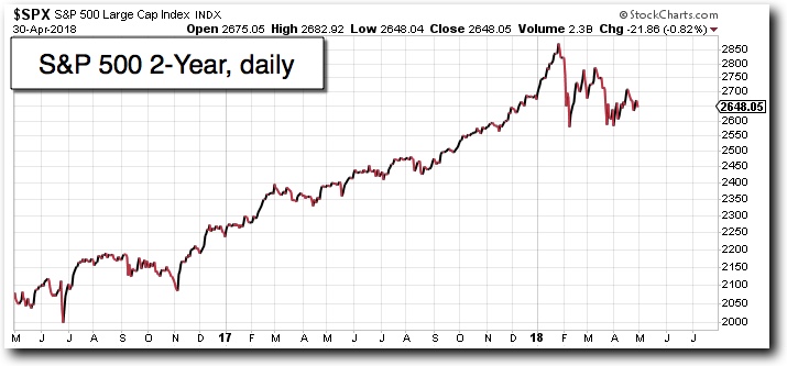
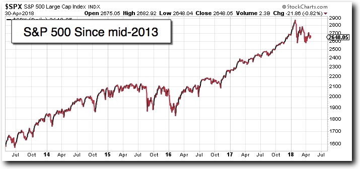
Sure, we can see that stocks, in general, went from a strong bull market to behaving indecisively. Major averages like the S&P 500 (made up of 500 large-cap stocks) often give a pretty decent general idea of what’s happening but that’s not good enough for us when our hard earned money is at risk.
The U.S. stock market is made up of approximately 3,500 stocks (not counting the micro-cap garbage that are likely to be scams). The behavior of those 3,500 stocks is what matters to us – not what their behavior does to the market “averages”.
One of the best “market timing” indicators is the “Percentage of stocks trading above their 30-week moving average”. I’m sure they’ll come up with a shorter name than that, one day, that isn’t as confusing as the “percent 30-week”.
First let me preface by repeating that we, at Rowe Wealth, don’t claim to be able to see the future and we think it’s silly and dangerous to try to predict or forecast. Price trends exist so therefore we seek to beat the market averages simply by spotting trends early after they’re confirmed and we invest in them until they no longer are working.
The “%30-wk” tells us the short-term risk and behavior of the true stock market. And what it’s telling us right now is there is low risk to bulls and that stocks are attempting to regain their bullish momentum.
The NYSE %30-wk tells us the percent of stocks, listed on the NYSE, that are trading above the 30-week moving average (MA).
To understand its importance, first note there are lots of investors who simply view a stock as showing strong bullish momentum if it crosses above the 30-week MA and bearish if it crosses below the 30-week MA.
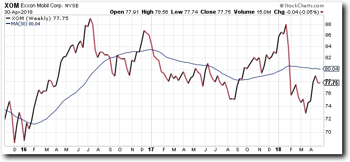
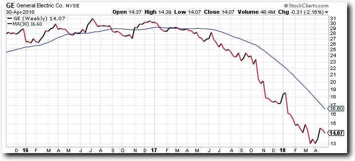
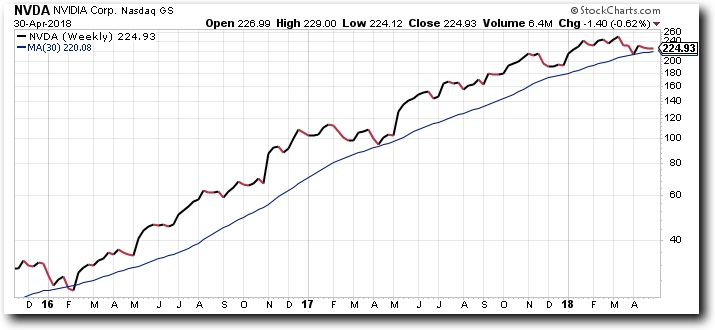
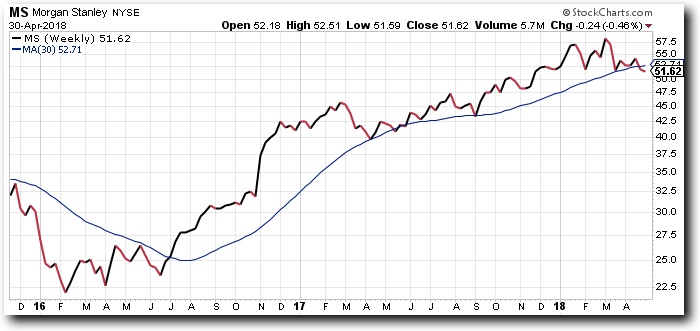
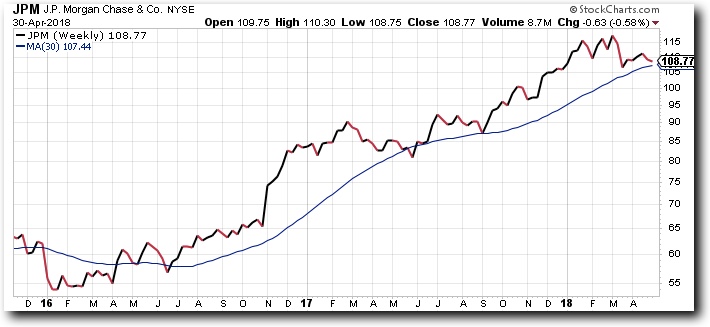
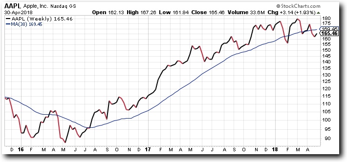
Check out these stock charts that have a blue 30-week MA overlayed. Note how they often (not always) enter a bullish trend when they cross above and vise versa.
The first one trades sideways cutting above and below the 30-week MA so we can obviously see the 30-wk MA crossover doesn’t guarantee a new trend…
And because a 30-week MA crossover doesn’t guarantee a new trend, we can use the %30-week to gain a sense of what a large group of stocks are doing. If a large group of stocks are moving above the 30-wk MA at the same time, then it’s much more meaningful to us with regard the the condition of the general stock market than a 30-wk MA crossover would say about one individual stock.
We view the %30-wk on a point-and-figure chart. Keep in mind, not all “P&F” charts are this indicator, the %30-wk. This is a common mistake for those who never view P&F charts. You can view any stock, ETF, bond, anything with a price, on a P&F chart.
Here’s the %30wk on a P&F chart:
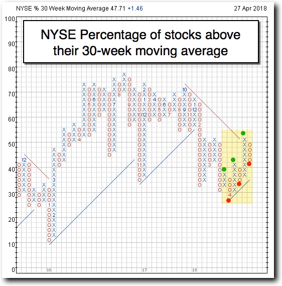
The years are the numbers at the bottom and on the left are the % of stocks above their 30-week MAs. The chart creates a new column whenever the reading moves by a significant amount (6% to be exact). Each box represents a 2% change. The most recent column is on the right and O-columns (like the most recent one) are seen when the reading is declining and X-columns are seen when it’s advancing.
The numbers on the left are from 0 – 100 because the reading is a percentage. I highlighted, in yellow, data since mid-March.
The numbers within the Xs and Os represent the month changes. For example, you can see how that “4”, at the lowest point we’ve recently seen, represents the box being filled when the month had gone from March to April.
While the most recent column is an O-column (downward movement), notice the most recent 6 columns are moving higher – making higher highs and higher lows.
The second to most recent column (X-column) shows when we went from having only 36% of stocks trading above the key 30-wk MA to 52% of stocks trading above their 30-wk MA.
Think about that.
While some stocks registered as stocks moving back below it and some registered as moving back above it, the NET result was that 16% of stocks went from below to above their 30-wk MA. That says a lot.
Sure, most recently the number declined. But the bigger picture of higher highs and higher lows show us that, as the stock market moves up and down and up and down again, what’s happening is a larger and larger number of stocks are participating in the upward pulses.
The higher lows are telling us that fewer and fewer stocks are participating in the downward pulses of the stock market.
This is bullish activity.
Nothing is a guarantee. But this is a pretty solid indicator. The fact that it recently got down to the 30% level means it was technically “oversold”. The higher highs are considered to be “buy signals.
Take a look at how “oversold” the indicator got at the key 2016 low. The %30-wk got as low as the 12% box. That means 88% of stocks were below their 30-week MAs while only 12% were above them.
Take a look at what the key market average, the S&P 500 was doing and what followed.
The more oversold the indicator is before seeing higher highs and higher lows, the happier we are as bullish investors. We won’t see that unless the market gets slapped around some more but we did get down to the 30% level that many think is “oversold”.
A majorly oversold reading is when it gets below 20%. That’s when we say “it makes sense drop everything and buy the relative strength winners right now”. But instead of being in a beaten down market we are in one of the strongest bull markets we’ve seen.
It’s nice to see the higher highs and higher lows. It’s nice to see it happening off of a somewhat oversold level. It shoudl definitely make bulls feel more comfortable about the current market condition. But perhaps we will see more bloodshed, especially since it’s a mid-term year, which is usually a very choppy year.
Look at it as a gift. The stock market is extremely strong in the long-term and it’s nice enough to be choppy for much of this year, giving you the opportunity to get into some of the sexiest relative strength winners at reasonable prices.
The next year, the pre-election year, is by far the strongest year. On average, since the Nasdaq was launched in the 70s, the gain from the mid-term low to the following year high averages a gain of 71%. You didn’t misread that and it’s not a typo. That’s an entire stock market average we are talking about.
The S&P 500, since 1950, returned investors 49% on average, from the mid-term low to the following year high.
You see, the stock market is not so mean after all.
Sometimes the nicest gifts are disguised as headaches. We can’t have great opportunities without bad news and scary markets.
If you’re working with an account that has a minimum value of $500,000, we want to talk to you. We know that our investment style – Relative Strength Investing – isn’t for everyone. But most people have no idea what they’re missing and there are many variations of RS investing. So if you maintain liquid assets north of $500k, I encourage you to sign up for a consultation here.
And for those of you who don’t have over $500,000 to invest, please understand that we do a heck of a lot of work for our clients and our fees are very reasonable and for that reason, we must require the minimum amount. Otherwise, we would actually lose money, based on the work that we are doing. Please don’t take it the wrong way. We will continue writing educational articles for you. And if you can refer someone to us with an account north of $1,000,000 then we would manage your account for you because the profit margin would then make sense.
Happy trading. Please invest safely.

Tags

Get Our FREE Guide
How to Find the Best Advisor for You
Learn how to choose an advisor that has your best interests in mind. You'll also be subscribed to ADAPT, Avalon’s free newsletter with updates on our strongest performing investment models and market insights from a responsible money management perspective.
