
Related Blogs
July 9, 2018 | Michael Reilly
In spite of all the tariff talk out of Washington and continued volatility on Wall Street, the second quarter ended in the green for a large swath of the US Equity marketplace.
Both the cap weighted SPDR S&P 500 ETF (SPY) and the Invesco, S&P 500 Equal Weight ETF (RSP) – both of which are considered market proxies by many investors – ended the quarter up 3.09% and 2.42%, respectively.
U.S. Equities have remained the dominant investable Asset Class, and Technology continued its stranglehold as the strongest U.S. sector on a relative strength basis.
Rounding out the remaining top five sectors on a relative strength basis were; Financials, Energy, Industrials and Consumer Cyclicals.
Year to date and 2nd quarter returns can be seen in the bar chart below, using the SPDR Sector ETFs as proxies.
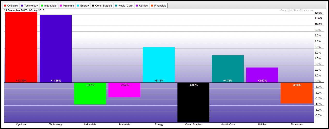
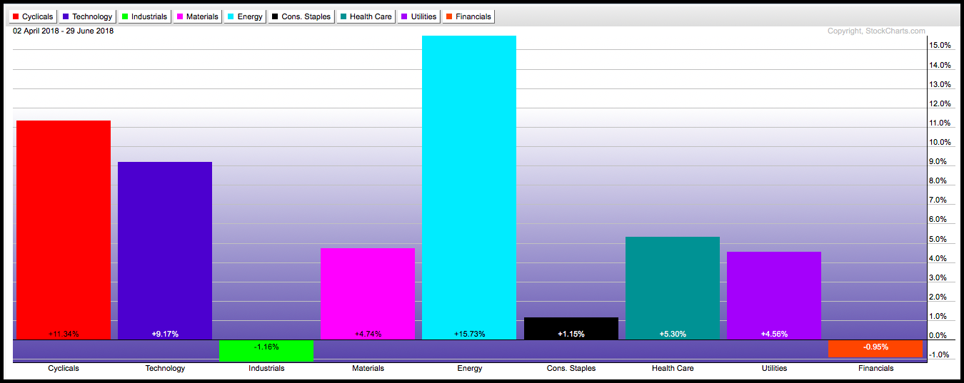
Three of the top five relative strength sectors had strong quarterly performance, posting returns that tripled the returns of both the cap weighted and equally weighted S&P 500 funds (SPX and RSP).
Cyclicals (XLY), Tech (XLV), and Energy (XLE) all had strong showings for the quarter, rising by 11.34%, 9.17%, and 15.73% respectively.
Energy (driven primarily by increasing oil prices), rose to the #3 ranked sector spot during Q2 – and was the clear winner on an absolute return basis, up 15.73% between April 2 and June 29, 2018.
For more about the recent rise in the Energy sector and Commodities, see our previous articles here and here.
Financials and Industrial ended the second quarter as the #2 and #4 ranked sectors on a long-term basis.
But, on an absolute return basis, both sectors found themselves in negative territory. Both year-to-date and for the second quarter.
Taking a closer look at Financials, we see a strong uptrend that began in 2016 and continuing throughout 2017 – It’s what propelled the sector to the #2 ranked sector of the 11 sectors we track.
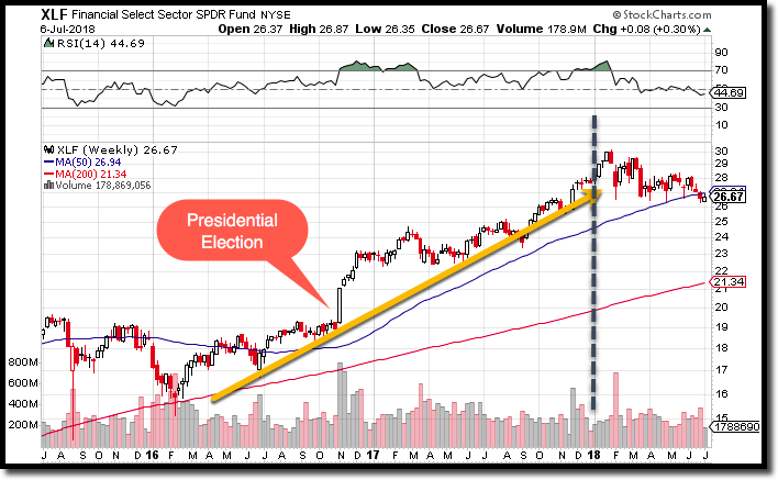
But, as seen here on the price chart, Financials have struggled thus far in 2018.
The question on the minds of many investors now is: have Financials run out of gas? Are the big gains all in the past or can Financials catch their second wind…and a bid with it?
Financials remain the #2 ranked sector in the U.S. market. So, long term, their status should still be respected by technical investors.
However, the price chart (above) doesn’t look very encouraging – showing a series of lower highs and leading to a break below the 50 day moving average.
And…the Point & Figure (P&F) chart for the Financial sector – using the SPDR Financial ETF (XLF) as our sector proxy, shows supply in control of the sector since February.
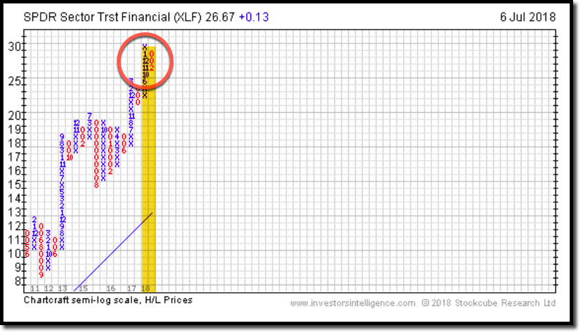
As a primer (or a reminder) for those investors who already utilize Point and Figure Charting, a P&F chart is an incredibly useful tool we often look to in order to confirm the amount of market participation for a particular stock or ETF.
A column of “X’s” indicate that demand or buying is control. A column of “O’s” indicates supply or selling is in control.
Note that P&F charts are considered a risk barometer and are not necessarily a tool that should be used for the timing of trades.
You can think of it as a guide to whether supply or demand is currently in control, and to what degree the position or sector may be overbought or oversold.
For those interested in more about the use of P&F charting, please feel free to set up a consultation by clicking here. We have advisors ready to assist you with whatever you need.
Not only do P&F charts allow us to look at sectors, but they allow us to dissect a sector and look deeper – at specific sub-sectors that comprise a sector. In this case – Financials.
This is a worthy undertaking, because we want to know if the financial sector is weakening (as many market “experts” would have you believe) or if there is just a particular sub-sector of Financials that should be avoided (at least until demand re establishes itself).
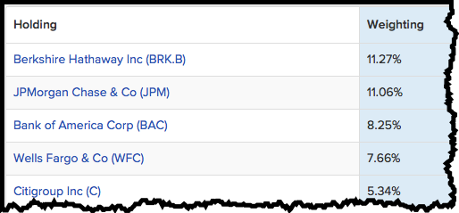
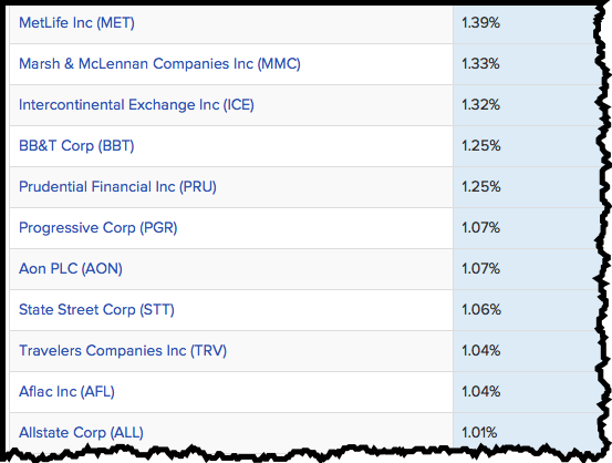
Below is a list of the 5 largest holdings in the often referenced financial sector proxy – XLF, followed by companies that make up at least 1% holdings of the ETF.
We can see here a mix of Banks, Brokerages, and Insurance companies.
Below, I’ve added three P&F charts illustrating the level of market participation (interest) in three sub-sectors comprising Financials.
The first is Banks:
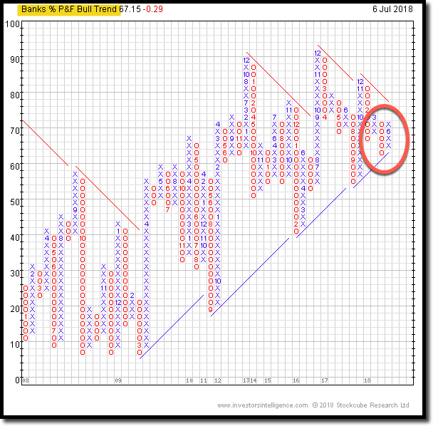
The column to the far right is in “X’s”, indicating demand is in control of the banking sector – after supply (column of “O’s”) had control earlier in the year.
Next is Finance:
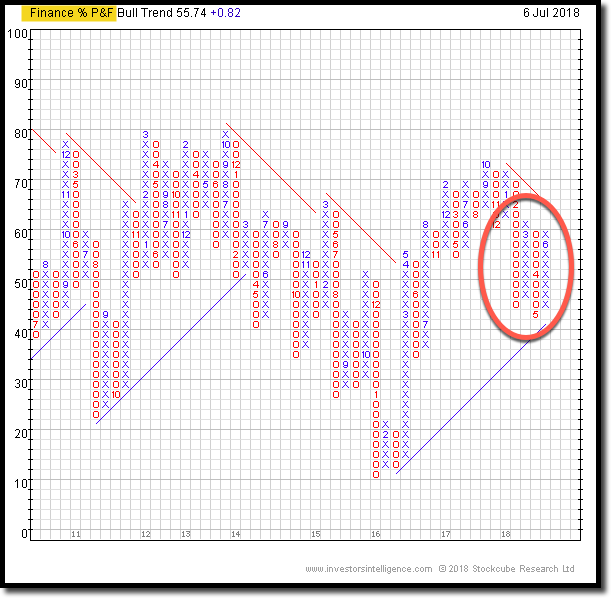
Here again, after supply took control of the Finance sub-sector earlier in the year (with multiple columns of “O’s”) Demand reemerged in June – which you can see as a column of “X’s” on the far right of the chart.
And last, the P&F Chart: Wall Street.
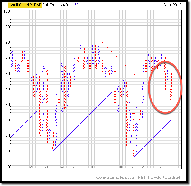
Now…pay attention, because this chart tells a different story than what we are currently seeing in both the Finance and Banking sub-sectors of Financials.
The long column of “O’s” on the far right of chart indicates supply, and therefore selling pressure, is in control of Wall Street stocks. This selling has been dominant since April.
Until selling pressure subsides, there is elevated risk to investment in this sub-sector of Finance.
So, as can be seen above, there has been selling in the Financial sector, as evidenced in the P&F chart of XLF and in the price chart- so selling can still impact the #2 ranked sector here in the U.S.
But, when drilling down into what comprises the sector (the sub sectors), we can isolate areas of potential strength and weakness, helping determine what is really happening in the sector.
So, what happens from here? Well, regardless of what market pundits predict about the future direction of Financials or markets in general, the fact is…we simply don’t know what the future holds.
The best we can do is implement an investment process that we believe may give us the best opportunity to outperform markets over time.
At RWM, the primary decision-making tool we use is relative strength because of its proven superiority. Constructing Relative Strength matrices comparing Asset Classes and sectors within those Asset Classes to one another allows us to see the raw data within the market.
This method helps us to identify areas within a particular investable universe, such as US Equities, that have the greatest likelihood of outperformance.
And, in our opinion, that is the best anyone can ask for when it comes to investment strategies.
One of the most important (and often overlooked) benefits of a rules based investment process like ours, is the fact that it offers a systematic way of capturing market trends without the input of human emotions and behavior.
And that’s what our methodology and models provide – a systematic, unemotional process that allows us to manage portfolios with “as little interference as humanly possible.” Thus avoiding emotional trading that has doomed many novice and professional traders.
By eliminating this outside “noise” such as rumors and speculation, you stand to significantly increase your chances at balancing your portfolio to outperform the market.
If you have any questions about anything you’ve read above, feel free to set up a free consultation with Rowe Wealth Management.
For the month of July, we are offering to assess your current portfolio to determine whether or not it’s currently following the strongest relative strength trends.
Click here to see available appointment times now.

Get Our FREE Guide
How to Find the Best Advisor for You
Learn how to choose an advisor that has your best interests in mind. You'll also be subscribed to ADAPT, Avalon’s free newsletter with updates on our strongest performing investment models and market insights from a responsible money management perspective.
