
Related Blogs
January 4, 2019 | Michael Reilly
The market correction that began in October has been sharp and relentless.
And the constant barrage of headlines out of Wall Street has done little to ease the minds of shaken investors.
Glance over the news and you’re likely to see headlines discussing tariffs, a government shutdown, Fed policy, or talk of recession and a bear market…
Investors are rattled and I can’t blame them. It’s a scary time right now.
But if investors know where to look, they may just see things from a different perspective..
And it comes in the form of an often underutilized market compass.
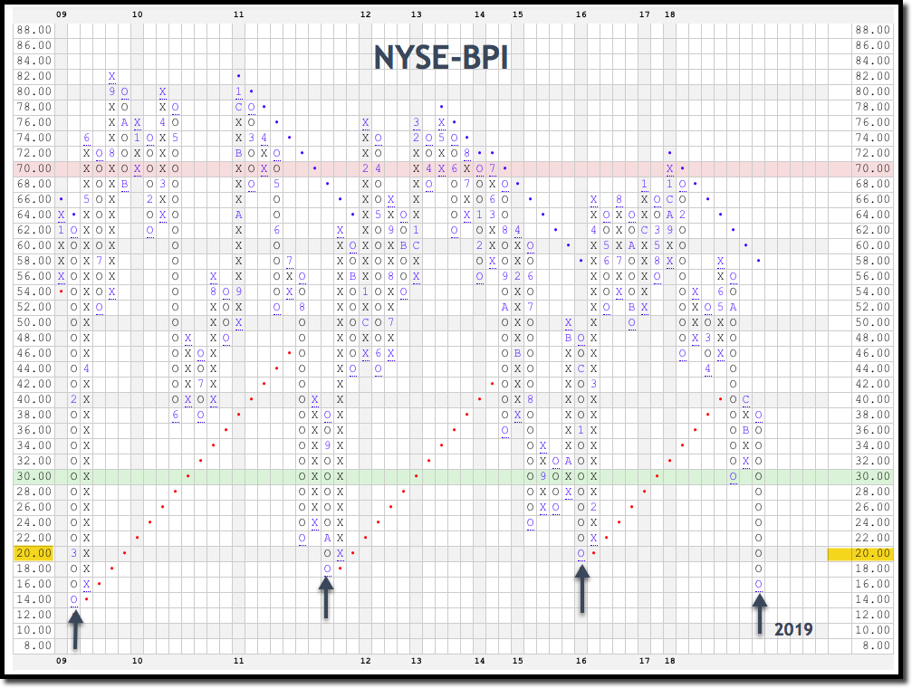
The NYSE BPI or Bullish Percent Index.
And before rolling your eyes in boredom, like you just unwrapped yet another sweater from Santa, consider why I refer investors to this chart in the first place…
It’s because this “boring” internal market indicator has helped many investors find opportunity where others saw only despair.
It’s a risk barometer. A gauge of the market, meant to measure the percentage of stocks trading on the New York Stock Exchange that are on buy or sell signals. Basically, it illustrates how many stocks are participating in a move.
And that’s something you can’t see by watching the external markets (the DOW, S&P 500 or NASDAQ).
In my opinion, investors would be foolish not to refer to this indicator while developing a market stance.
Before investing, traders and long-term investors alike should first understand the overall health and direction of the market.
Not having the ability to see the market clearly is like walking through your living room blindfolded, hoping no one moved the furniture. You might be okay… or you might break a toe.
So, to avoid the pain of stubbing a toe in the markets, you can use the very same tool we use as the foundation of our market stance.
The NYSE BPI illustrates the constant tug of war between supply and demand.
It behooves investors to know who’s in control of the market – buyers or sellers, supply or demand.
And that’s what the NYSE BPI measures – supply vs. demand. Once you understand that relationship, as an investor, you are better prepared to apply the proper buy/sell strategy.
For those new to how the NYSE Bullish Percent Index works, here’s an abbreviated summary.
When demand is in control of the market, and more and more stocks move to buy signals, the NYSE BPI moves to “X’s” and rises in the percentage of participation.
But when supply takes control of the market in the form of selling, stock prices fall, the BPI flips to “O’s,” and the level of participation decreases.
There are two noteworthy areas of extremity on the chart. The 70% level and the 30% level.
When over 70% (red line) of stocks are on buy signals that’s considered a bit excessive (overbought) and caution should be used because there’s greater risk of a sell off at these sometimes lofty levels.
On the other hand, readings at or below 30% (green line) are considered low risk, as stocks below this line are considered at oversold levels.
So, those are the basics, now here’s where it gets more interesting….
There are times when this indicator gets more than just oversold – it becomes completely washed out.
These washed out levels only emerge when fear grips the market and investors hit the panic button and sell, sell, sell.
It doesn’t happen often, but when it does, it can offer some tremendous buying opportunities!
Since the financial collapse of 2008-2009, there have only been a handful of these opportunities presented to investors with the discipline and mental fortitude to take advantage.
I’ve indicated these opportunities on the chart above – see arrows. The NYSE has only been this washed out 4 times in the last decade.
And right now, the NYSE BPI is at a level not seen since the end of the financial crisis in March of 2009 – so investors haven’t had this opportunity in ten years!
Imagine if you had a crystal ball in March of 2009 and could “see” that big institutions were quietly coming back to the market and their demand for stocks would cause prices to rise.
Most investors were too shell-shocked and just plain scared to see what was really happening in the market. They allowed their emotions to dictate their actions – or inaction.
And it’s really too bad, because it meant that investors missed out on a tremendous buying opportunity.
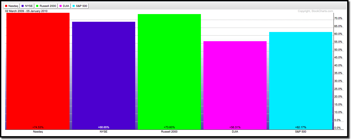
During the ten-month stretch between March 2, 2009 and January 5, 2010, all the major market indices skyrocketed.
The tech heavy Nasdaq jumped 74.53%, the NYSE by 68.65%, the Russell small cap index 73.60%, the DJIA 56.31% and the S&P 500 increased by 62.17%.
Although the NYSE BPI isn’t a perfect “crystal ball”, it can aid investors in seeing the true market more clearly.
To see this in full effect, I’ve included a price chart of the NYSE dating back to 2009 and I added the NYSE-BPI. The arrows are drawn from the times that the indicator hit historically washed out levels that coincide with market bottoms.
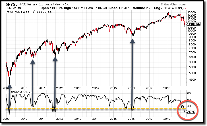
Follow the arrows up on the price chart and what you’ll see is in each occurrence – 2009, 2010, 2011, and 2015 – after hitting oversold and often washed out levels, the NYSE BPI provided investors opportunity to profit big as the market rebounded off the lows and moved higher.
As we begin 2019, we once again find a situation where the NYSE BPI is at extremely washed-out levels.
How long stocks will remain at these extreme washed out levels no one knows for sure.
But it is highly likely that investors will one day look back and realize this was indeed a buying opportunity masked as fear, panic, and Wall Street headlines.
Don’t follow the pack. Rely on various indicators, including the NYSE BPI and be aware of the potential opportunities as they arise.
Until next week, invest safely…
Note: If you’re feeling extra “market stress” at this time and are interested in a portfolio stress test or overall evaluation, feel free to get in touch with us either by emailing info@rowealth.com or by scheduling a consultation with one of our advisors. We’d be more than happy to help you assess your current risk levels and discuss how you might improve your position if the results scare you.
Tags

Get Our FREE Guide
How to Find the Best Advisor for You
Learn how to choose an advisor that has your best interests in mind. You'll also be subscribed to ADAPT, Avalon’s free newsletter with updates on our strongest performing investment models and market insights from a responsible money management perspective.
