
Related Blogs
April 19, 2018 | Michael Reilly
 Market volatility since February 2018 has led many to ask:
“Have we been experiencing corrections within a bull market… or is it the beginning of a bear market?”
That seems to be THE question on everyone’s mind.
First, let’s dispense with the obvious: there’s no crystal ball, and no way to know for sure.
However, the market does provide us clues if we’re willing to look for them.
Let’s begin with understanding that roughly two-thirds of Gross Domestic Product (GDP) is comprised of consumer spending. Consumer spending is what drives the U.S. economy.
So it makes sense to analyze consumer stocks for clues about the direction of the economy, investor sentiment and, therefore, the stock market.
Consumer stocks: Defensive vs. Aggressive
Consumer stocks come in two flavors, discretionary (aggressive) and non-discretionary (defensive).
When consumers feel good and are confident, they spend more on things they want (discretionary), rather than just things they need (non-discretionary).
On the flip side, when consumers are cautious about the future, they tend to purchase staples — “just the necessities” — and skip the “I’d like to have” items.
It’s the difference between buying a new car or laundry detergent.
And that difference is reflected in the price of discretionary stocks — like car makers Ford (F) and GM (GM) — and non-discretionary stocks, like toothpaste and pharmaceutical manufacturers Colgate (CL) or Johnson & Johnson (JNJ).
(We created a Discretionary versus Non-discretionary Consumer Sector infographic to help clarify the differences between the two sectors. Link will open in a new tab.)
Pay attention to this bull/bear ratio
The ratio of Discretionary Consumer to Non-discretionary Consumer price behavior is a solid indicator of stock market health. Not only does it review consumer stocks as a whole, but it also shows the relative strength of aggressive consumer stocks vs. defensive consumer stocks.
We track this ratio by comparing the relative strength of two representative ETFs: the Consumer Discretionary Select Sector SPDR Fund (XLY) and Consumer Staples Select Sector SPDR Fund (XLP).
Besides tracking price action on the S&P 500, the “XLY:XLP” ratio is yet another valuable tool in our technical indicator toolbox used to determine the sustainability of a bull market advance.
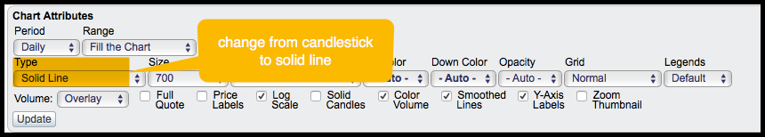
Investors can find this relative strength comparison by following this link to stockcharts.com.
Once there, switch from a candlestick view to a solid line by changing the “Type” setting under the chart:
During bull markets, this ratio should rise to indicate traders’ appetite for riskier consumer stocks. When the ratio turns considerably lower, investors need to consider that the market may be turning defensive.
And if this were to happen as the stock market is setting fresh all-time highs, it’s an outright bearish development.
But before we look at what the XLY:XLP ratio looks like today, let’s take a trip down memory lane and look at what this ratio looked like just before and during the last two bear markets; 2000-2003 and 2007-2009.
2000-2002 Bear Market
Moving from bull markets to bear markets is a process. It just doesn’t happen one day. Yet that’s exactly what mainstream financial media is trying to argue in 2018.
To illustrate this point about a “process”, let’s first look at the
S&P 500 chart as we moved into the 21st century.
Here’s a look back to Y2K, the year 2000:
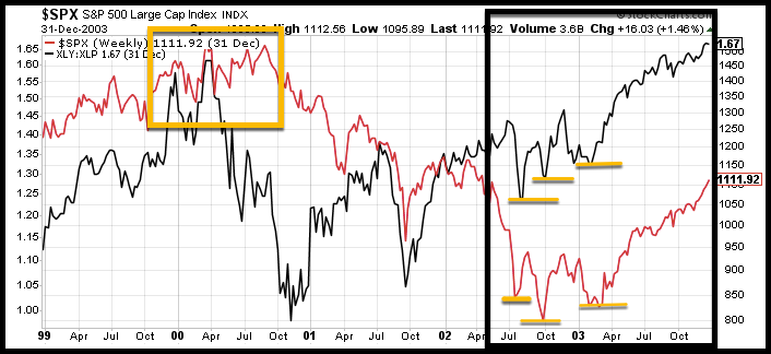
I’ve overlaid the XLY:XLP ratio (black line) onto the S&P 500 chart (Red line).
Take a look at the two S&P 500 tops (yellow box).
Looking only at the red S&P 500 line, you probably would have no idea that changes were taking place “under the surface” and that we were in the “process” of shifting from bull market to bear market.
But check out the tops in the XLY:XLP ratio (black line). As the S&P 500 formed two tops, the ratio had declined significantly in April 2000, indicating money was rotating out of offense (discretionary – XLY) to defense (staples – XLP).
The ratio raised a red flag to anyone savvy enough to spot it.
It works just as well at the end of bear markets too.
Referencing the chart above again, the S&P 500 continued to make a series of lower lows (highlighted in black box, with new lows indicated with yellow line), while the XLY:XLP ratio began making higher lows.
These higher lows, indicated that traders were becoming much more aggressive in consumer stocks , while the S&P 500 made its final bottom.
You see, these “behind the scenes” signals are powerful and let us know when we need to be cautious as market conditions change from positive to negative or negative to positive.
2007-2009 Bear Market
Below is a similar chart, this time from just before the start of our last bear market:
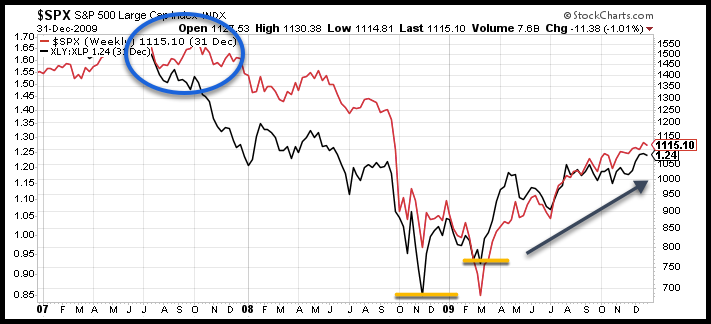
It was a very similar setup. We saw the XLY:XLP relative strength ratio decline in July 2007, three months before the rest of the world saw the decline confirmed in the S&P 500 Index.
Also note that the end of the bear market saw the XLY:XLP ratio turn higher before the final bottom occurred in the S&P 500 (yellow lines).
The relative performance of Discretionary vs. Non-discretionary consumer stocks provides a very important signal.
Don’t fall into the CNBC trap!
A falling market isn’t the sign of a bear market. A falling market is the “confirmation” of a bear market after smart money has already moved to defensive stocks.
What the XLY:XLP ratio is showing us now
Are the market pullbacks and increased volatility we’re seeing the start of a new bear market, or just a pause in an ongoing uptrend?
Let’s look at a current version of same chart.
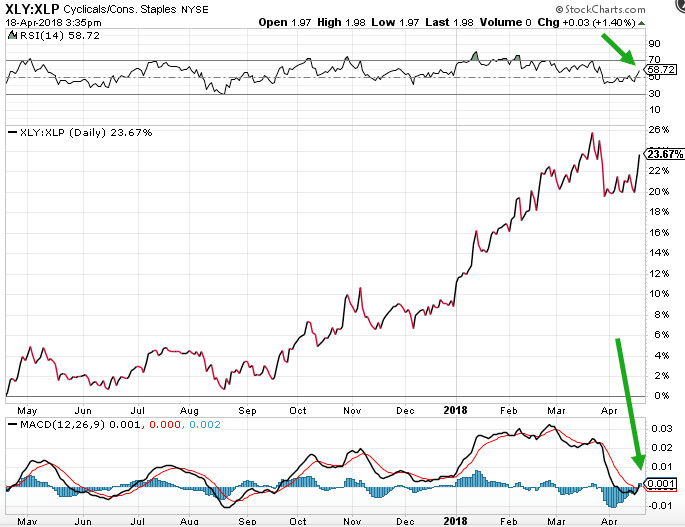
Looking at 2018, we can see the XLY:XLP relative strength line moved higher, dipped, and is again moving upward.
Above the chart, we see that the RSI (Relative Strength Index) has moved above 50, and though that’s not a “buy” signal, it is a bullish indicator.
Below the chart, the MACD (Moving Average Convergence and Divergence) shows that the MACD line has crossed above the signal line. This is a “buy” signal.
Now let’s superimpose the S&P 500:
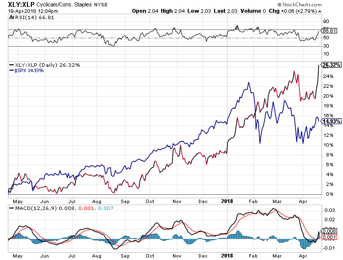
If we view the XLY:XLP relationship as an indicator of the broader market (and we do), then we can surmise that the bull market is healthy.
Note that the decrease in relative strength of XLY in late March followed the fall of the S&P 500 – it didn’t precede it. So this was not a case of smart money moving to a defensive position before confirmation by the broad market.
So, if this is a bear market, someone might want to let market participants in on the secret. For now, at least, the smart money is still in the game.
Does that mean investors shouldn’t be cautious? Of course not! With volatility remaining high (relative to what it’s been for the 18 months prior to the February correction) caution in the short-term is prudent.
But when looking at the markets from a technical basis, most indicators remain long-term bullish.
To put relative strength investing to work in your accounts, click the button below:
Tags

Get Our FREE Guide
How to Find the Best Advisor for You
Learn how to choose an advisor that has your best interests in mind. You'll also be subscribed to ADAPT, Avalon’s free newsletter with updates on our strongest performing investment models and market insights from a responsible money management perspective.
