
Related Blogs
March 30, 2021 | Michael Reilly
 It’s easy to get caught up in the day’s headlines and possible implications.
Maybe it’s news about the Biden admins projected COVID vaccine, Tax reform, or Friday’s news about what the fall-out may be from the liquidation of as much as $30 billion worth of equity positions, the latest over-leveraged hedge fund in the U.S. was hit with margin calls.
It’s always something. It’s always going to be something. That’s just how it works. Get used to it.
Avoid the news, it only causes stress. Sometimes the best way to see markets clearly is to step back and look at the bigger picture. Find the direction of the trend. As you’ll see these words can be worth their proverbial weight in Gold.
Look, here’s what we know as fact – Stocks trend. Bonds trend. Gold, Oil, and other commodities all trend. That’s a fact, look it up if you don’t believe me. They go up for a while, they go down for a while and sometimes they grind sideways for a while.
So today, I’m going to use this fact to check in on a few very important Intermarket relationships. These are the relationships or ratios, I turn to when I want to bring harmony back to my analysis.
If you ever find yourself caught up in the headlines or you’re unable to see markets as they really are – you can turn to these relative strength ratios. These ratios Identify which asset class or asset classes are exhibiting strength or weakness when compared to alternatives.
When we talk “risk-on” vs. “risk-off”, we’re considering risky asset classes- stocks or commodities vs some of the more defensive asset classes (cash or bonds). This analysis goes a long way to answering – should we be buyers of stocks or sellers of stocks.
Our first Intermarket ratio compares stocks to bonds. A rising line favors stock ownership over bonds, while a falling ratio line favors the relative safety of bonds overstocks.
Here’s a tip – when in doubt, zoom out.
If we only look at a month’s worth of data, it can be messy and difficult to get a hold of what’s really happening. Just look at this ratio chart. One week it’s “risk-off” (bond overstocks) the following two weeks the ratio favors a “risk-on” environment of stocks over bonds. A week later it reverses yet again..etc. Yuk.
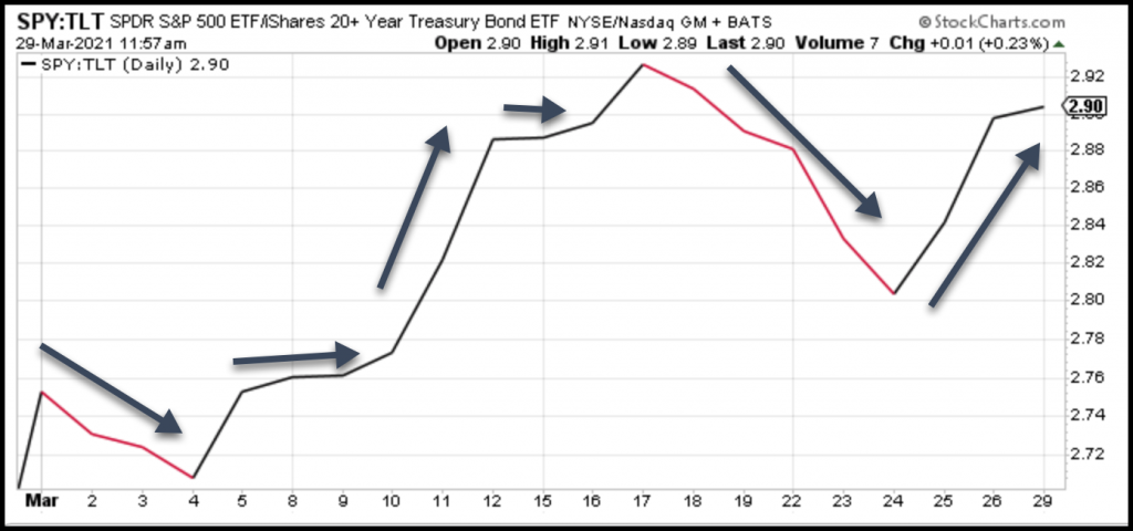
When a chart looks like this, zoom out to the next longer time frame.
Ahhh, this is much better. Although it’s been a choppy ride in the short term view, when looking out over a more meaningful time period, the trend is clearly higher – indicating stocks over bonds or “risk-on” over “risk-off”.
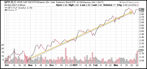
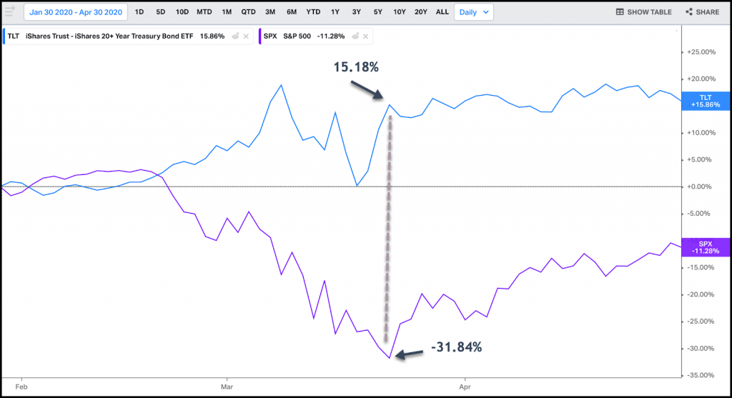
Now to put today’s environment (favoring “risk-on”/stocks over bonds) into perspective – compare it to what this same relationship looked like a year ago.
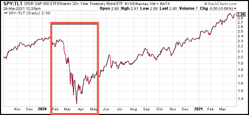
That was clearly a warning to investors that there was some real trouble for stocks. On an absolute basis, stocks got smashed to the tune of -31.84% in just a matter of weeks, while Bonds (TLT) gained 15.18%.
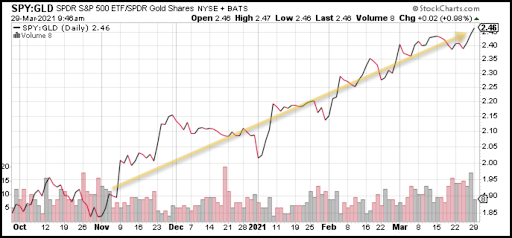
Now lets another intermarket relationship, comparing the growth and potential risks of the S&P 500 to another safe haven – Gold. If equity markets were under any serious pressure, Gold would be rising relative to stocks – but they are not. In fact, stocks continue to rise vs. Gold on both a relative and absolute basis.
And here’s the performance of major equity markets over the previous 1 month, 3 month, and 6 months.
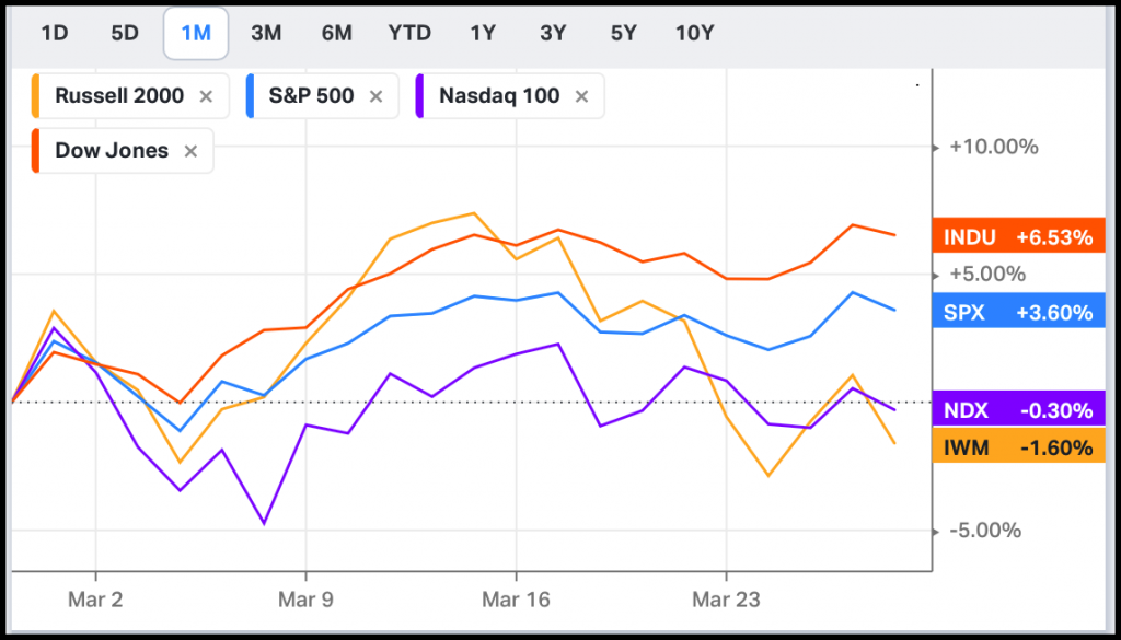
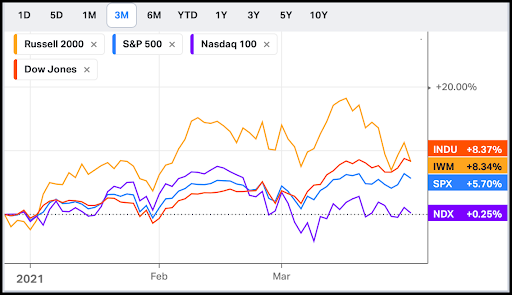
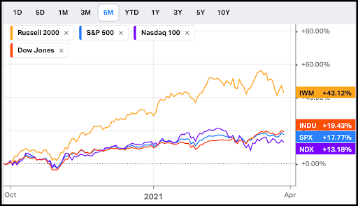
Did the headlines scare you out of these market returns? Was it a costly lesson? If so, do what I do, rely on price data. That’s how we keep our emotions in check. We use Intermarket analysis and ratios like the ones above every day. So we know exactly how to view global markets.
And here’s one more little investment nugget. This one’s important, so pay attention. You want to watch credit risk because credit leads to equities.
And we can see credit risk is.
High Yield is the risk-on a segment of the credit markets, while Government bonds, like the 7-10yr T Bond, are the safety play. By tracking price moves between these two distinctly different bond market participants we can gain some perspective on what one of the most important markets on earth is doing.
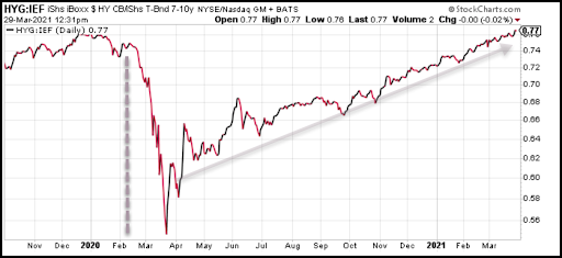
Here, we are comparing the iShares High Yield Bond ETF (HYG) to the iShares 7-10yr Gov’t T-Bond ETF (IEF). In Feb last year (2020) High Yield bonds – the risky stuff, started selling off before completely tanking vs T-Bonds moving into March. That’s a classic risk off-head for the hills move, where money moved out of High yield bonds and into the safe haven of Treasuries.
The credit market gave equity investors a head-up that there was something wrong. The credit market was getting defensive while the S&P 500 was still hitting new all-time highs.
Now, fast forward through the summer of 2020 and into 2021 – it’s a completely different narrative. High yield bonds, the risky part of the bond market is showing tremendous strength vs the defensive Treasury bonds. Meaning risk-on over risk-off.
So remember, if you want to know what’s happening in the stock market – It usually comes down to credit… If we’re not seeing any stress in credit, the market is in pretty good shape in the big picture.
Until next week…
Tags

Get Our FREE Guide
How to Find the Best Advisor for You
Learn how to choose an advisor that has your best interests in mind. You'll also be subscribed to ADAPT, Avalon’s free newsletter with updates on our strongest performing investment models and market insights from a responsible money management perspective.
