
Related Blogs
March 10, 2025 | Chris Rowe
If you’ve been reading me for a while, you know I make use of an indicator called the “RSI” which stands for “Relative Strength Index.”
Some people, when they hear the term “relative strength index” think it refers to “relative strength investing” or to a “relative strength” chart.
It doesn’t — a relative strength chart is a different animal from a different zoo, and we’re going to visit it today.
First, some background…
Whether its headlines are about drones… Cabinet positions… Chinese AI startups… Or whatever…
The mainstream financial media has an interest in keeping you frightened of the future. Don’t take the bait. No matter what happens, the market will react and things will change, as always. Which is fine, because we can react accordingly.
But in order to react accordingly, you first have to clearly see what’s actually going on, right now.
Once you can clearly see what’s actually going on, you stand a much better chance of beating any type of market. If you’ve followed me for any amount of time, you know that I built my fortune around a particular investing framework. It’s a simple, proven approach that stands on two pillars, which you’ve heard me mention before: sector rotation and relative strength.
In my 30 years trading, writing and teaching, I’ve never found a better approach, or one that outperforms the market so reliably as the approach that uses these two pillars.
And in a nutshell, this strategy comes down to buying what’s working and selling (or shorting) what’s not. But, again… step one is to clearly see what’s actually going on.
Today, I want to focus on the second of those pillars – relative strength. Specifically, I want to contrast “relative performance” with a related but very different idea. A famous man (damned if I can remember his name) once quipped that marriage was like a long meal with the desert first. This Sunday School column is longer than most, and for good reason.
What follows might not seem to be the coolest subject on Earth. But take it from me. It can have a huge impact on your wealth.
Relative performance studies are used to compare the performance of one security over another. They’re often used to compare:
- A stock against a benchmark index (such as the S&P 500)
- A stock to its sector (or industry group)
- A sector against a benchmark index (such as the S&P 500)
- A sector to another sector
In fact, you can find relative performance trends in just about all marketable assets.

Pick any one of the four combinations above.
Relative performance studies make it possible to determine if “Security A” is stronger or weaker than “Security B.” This is critical information when it comes to managing your investments because the recent and current relative strength speaks to the probability of near-term future strength.
Stocks, bonds, or exchange traded funds that are showing winning characteristics tend to continue showing those characteristics for a long time. It’s like a talent scout who goes to different schools to watch the sports team.
The likely future winners stand out early. The trick is to know what characteristics to look for (see clearly) in order to spot the future winners. In this article I’ll discuss the power of using relative performance studies for sector selection.
Then, we’ll see why this method of identifying strength is superior to that other related-but-different idea – comparative performance studies. You can use both approaches to identify securities likely to be among the strongest performers in the near future. So both tend to outperform the general market averages over time.
Many studies compare the benchmark indexes like the S&P 500 to “momentum index” models). And most momentum index models base their security selection on “comparative performance.”
And while these momentum index models tend to outperform benchmark averages over time, relative strength models show even better risk-adjusted performance. Now, many folks might consider comparative performance to be “good enough” for many investors. And to be fair, comparative performance might be easier to understand. But we aren’t satisfied with “good enough.”
That’s why we use sophisticated relative performance studies to select the securities we invest in.
Relative strength isn’t complex. So don’t be “that guy” who glazes over when we discuss it. Instead, wrap your head around it and generate superior returns.
How are relative performance studies superior to comparative performance studies? The answer has to do with…
The Drawbacks of Comparative Performance Studies
A comparative performance chart between two securities will show two lines on the same chart. They both start at 0% on some particular date. Security A might outperform security B, when viewing the two in one time frame, but underperform security B when viewing them in a slightly different time frame.
This can make it difficult to tell which security is currently stronger, which is a problem because the whole idea of “momentum based investing” is to identify which stock or sector is currently showing the most strength. Those that are currently the strongest are likely to be stronger in the foreseeable future.
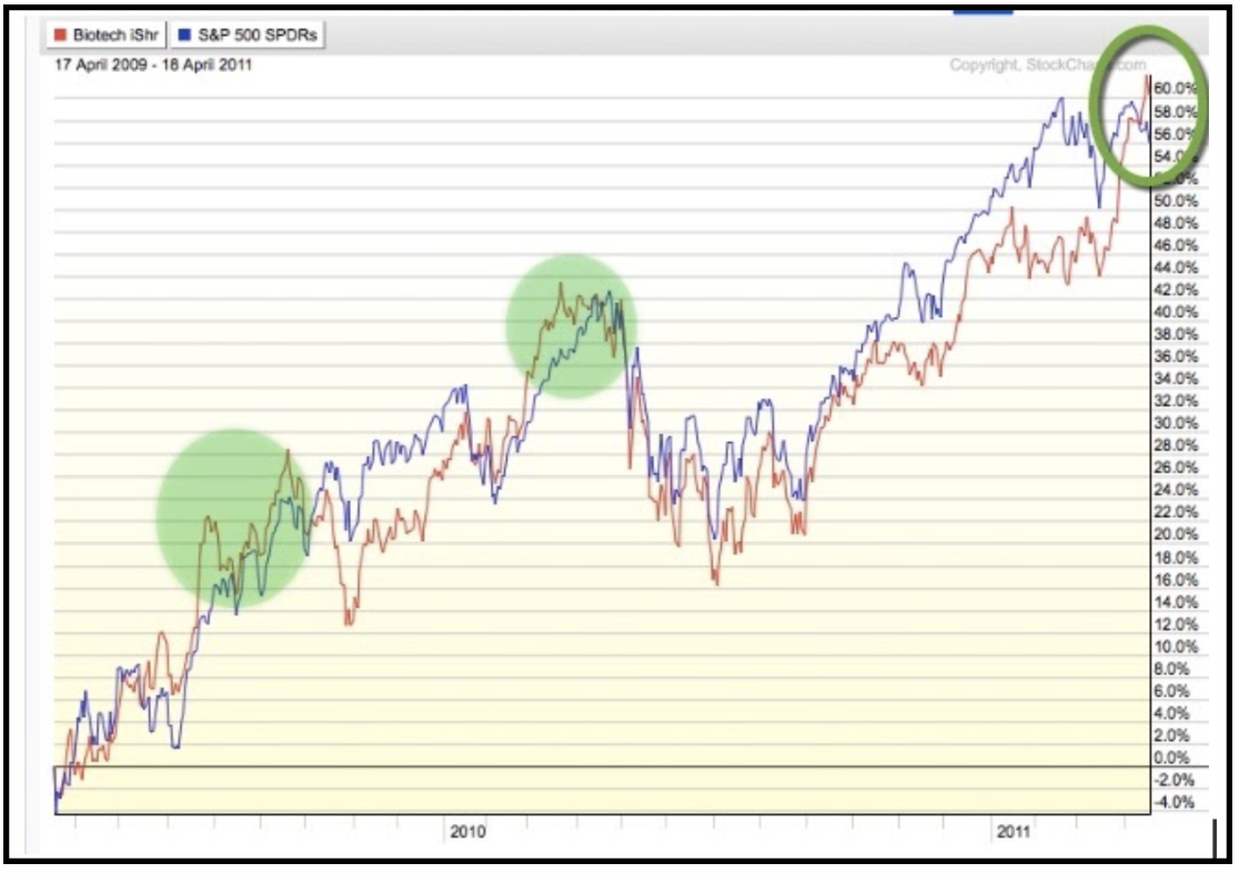
For example, the comparative performance chart, below, compares the 2-year performance (April 8, 2009 – April 8, 2011) of the biotech sector ETF, “IBB,” to the S&P 500 ETF, “SPY.”
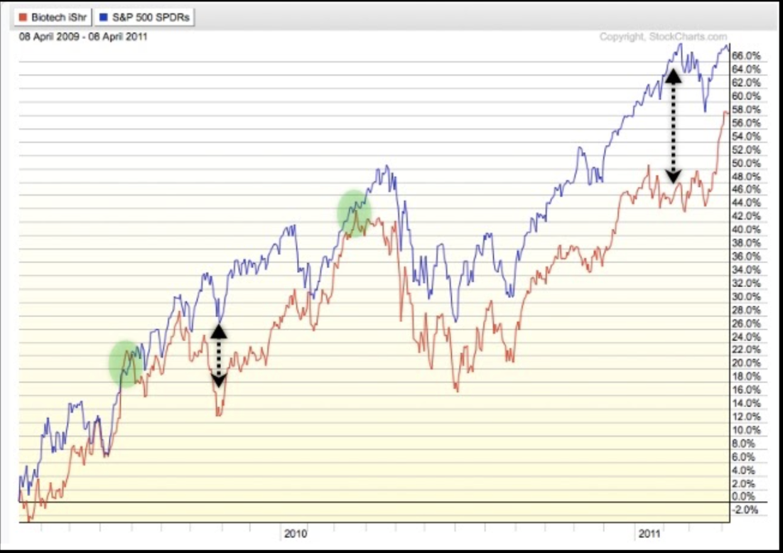
In the particular two-year time frame covered in the chart, SPY (blue) is up by more than IBB (red). SPY is up 67.48% while IBB is up 58.21%.
Study the chart for a moment. At what point, if any, do you think you might have felt IBB was about to show superior strength, thus making IBB a more profitable investment? The green circles highlight times when IBB (red) seemed to come close to outperforming SPY (blue). On both occasions IBB ultimately failed.
I also used the dotted arrows so point to times when the comparative performance for IBB was much worse than SPY. Here’s the chart again, so you don’t have to scroll up.

Check out what the end result was when using these two dates as starting and ending points. IBB seems to underperform SPY by ten percentage points over the two years. But look what happens when, instead of comparing the two ETFs from April 8, 2009 to April 8, 2011, like in the chart above, we move the entire comparison up by just a few trading days.
Below, we compare SPY and IBB from April 17, 2009 to April 18, 2011. Compare the chart above to the chart below.
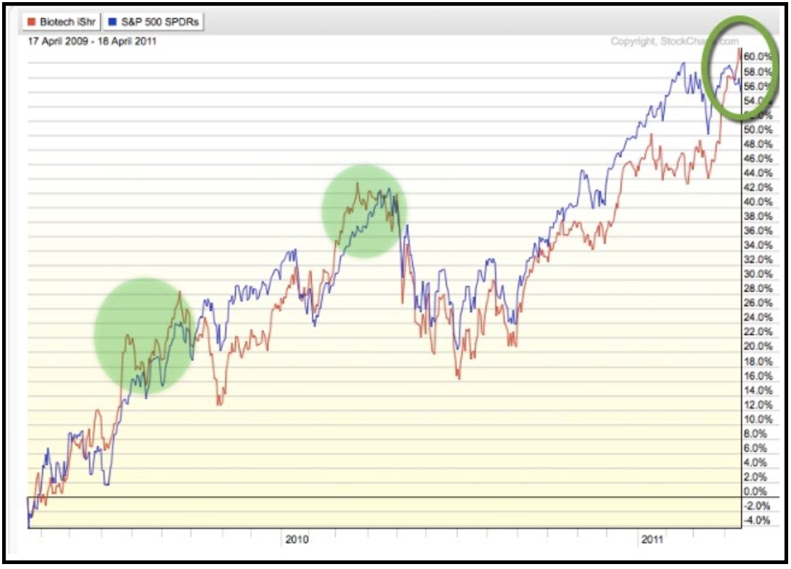
For much of the first half of the above chart, it seems IBB does in fact outperform SPY. Throughout the mid-2010 dip, it seems the two are almost in sync.
For the first half of 2011, IBB seems to underperform, but then actually ends the two-year time frame up 60.16% while SPY is up 55.98%. The first two green circles, above, show times when IBB seemed to “catch up” to SPY. At each of these points, you might have thought, “Since IBB caught up with SPY, or seems to be outperforming (as of the starting point of the study), it must be a good time to favor IBB over SPY.”
But, as you can see, this was the worst time to enter IBB as it subsequently fell by more than SPY from those levels.
SPOILER ALERT: You’ll soon see that the opposite was true after the period indicated by the third green circle, above. Instead of a 2-year comparison, the next chart uses a 1-year comparison, again ending on the same date of April 18, 2011. In the selected time frame (ending April 18, 2011), IBB (red) managed to beat SPY “by a nose.”
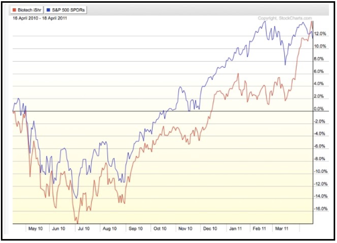
You can’t see it on that chart, but IBB underperformed SPY from April 1, 2010 to April 1, 2011 (the beginning of Q2) by 4.46%, so any momentum model rebalancing at the beginning of each quarter or each month, based on trailing 12 months, would not have owned IBB – Big mistake.
The Virtues of Relative Performance Studies
Instead of viewing a comparative performance chart of IBB and SPY, let’s check out the relative strength chart of the two. KEY POINT: Unlike the comparative performance chart, the relative picture doesn’t change based on the beginning and end dates on your chart.
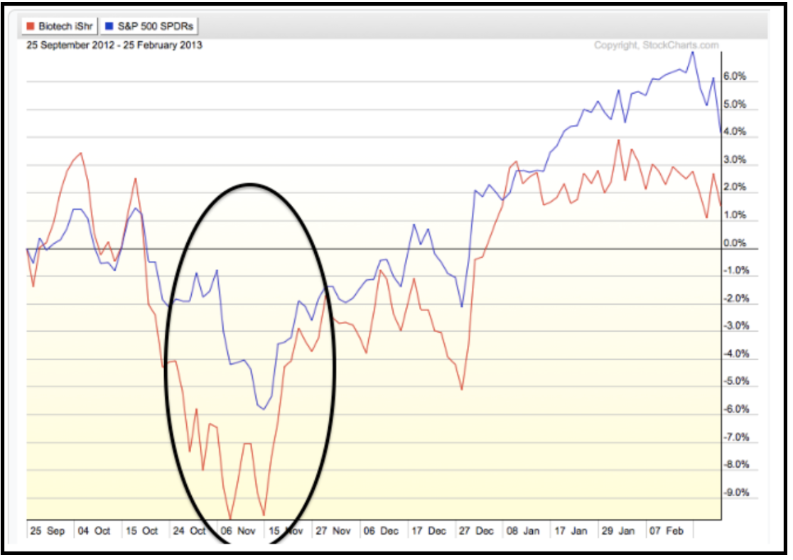
For example, here’s the comparative performance chart of IBB and SPY starting on September 26, 2011. Using this starting date, IBB’s performance is way above SPY’s.
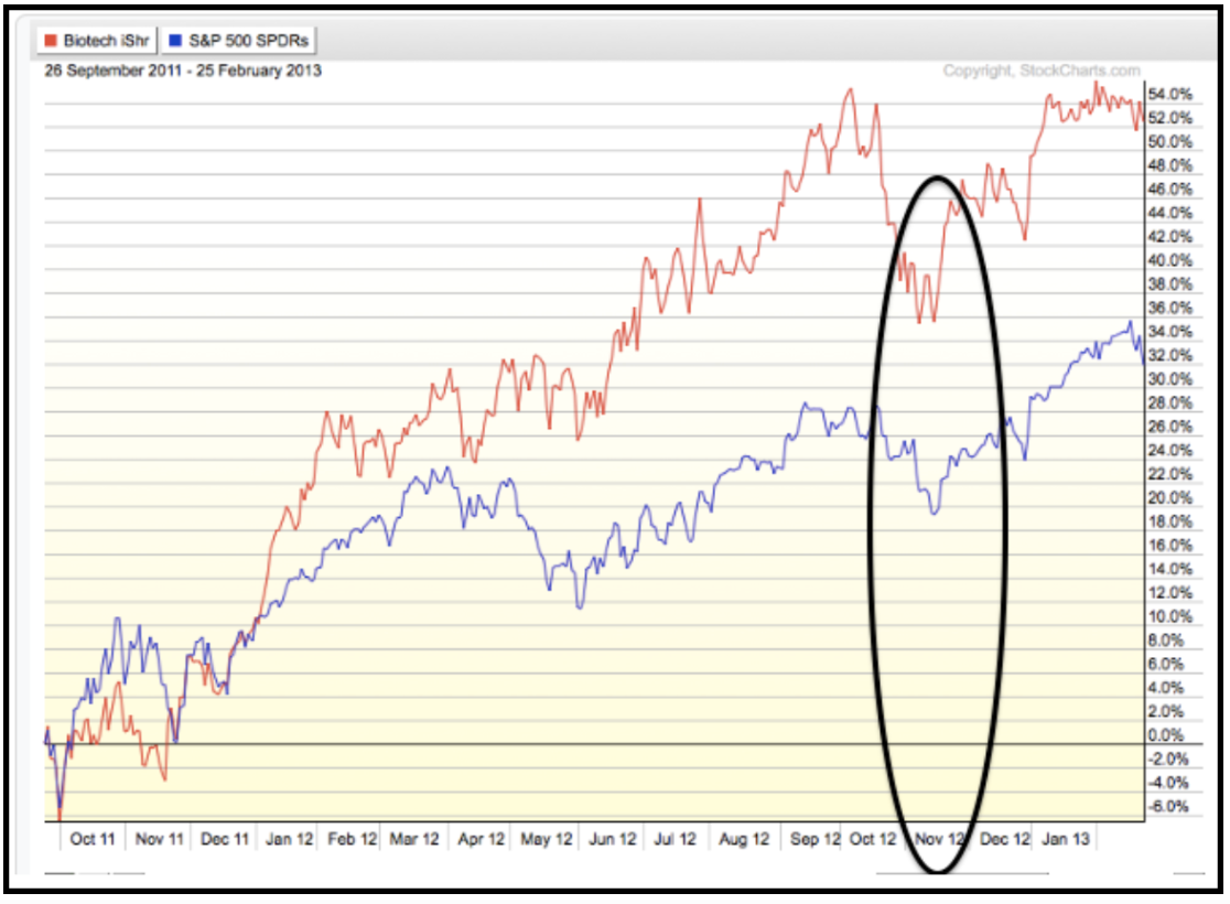
But when we change the starting date to a year later, to September 25, 2012, IBB’s performance is below SPY’s.
On a relative strength chart, the chart pattern will look the same no matter what time frame you choose to view. Because the picture doesn’t change, we can make investment decisions based on what are called “relative strength Buy signals.”
A relative strength Buy signal occurs when a relative strength chart makes a higher high after being on a Sell signal. Sell signals occur when the chart makes a lower low.
The RS chart below shows that IBB vs. SPY had been making lower highs and slightly lower lows. But then, in April of 201 it made a higher high, which is an RS buy signal.

This would be a good time to take a step back and explain how a relative strength chart is created. Hold on to your seat for this rocket-science-level math equation: Base security / comparative security.
Seriously, it’s that simple. You divide one security (IBB) by the other security (SPY) and plot the result on a chart. The numbers plotted on the y-axis serve no value except to provide a place to plot the chart. In other words, the numbers ‘0.76 to 0.95’, above, don’t mean anything.
We only care about the relative strength “Buy signals” and “Sell signals.” In many respects you read a relative strength chart the same way as a regular stock chart. The chart above shows the relative strength of IBB versus SPY.
It is plotted daily. Every day IBB outperforms SPY the chart is plotted higher and when it underperforms it plots lower. Of course, on any given day one can outperform the other. But the new higher highs or new lower lows are used as Buy or Sell signals (just like on a stock chart). Here’s that relative strength chart again.
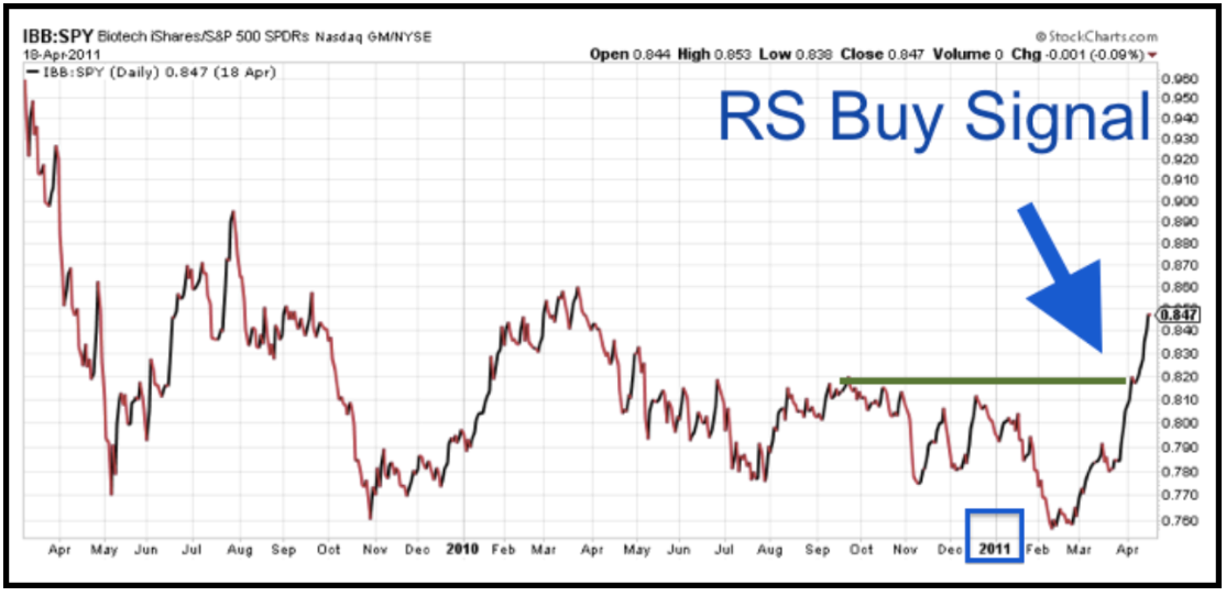
You can see that it made a series of lower highs and lower lows. In August of 2010 it did attempt a higher low (not marked) but the low wasn’t confirmed by a higher high. Instead it made a lower high, and that’s where I drew the green line. After making a slightly lower low in February 2011, the relative chart broke a “resistance level” in early April, 2011. This meant it moved to a relative strength Buy signal.
RS Buy or Sell signals are significant because, like a stock, sector, market index, bond, commodity or currency, relative strength relationships tend to trend. A RS Buy signal often marks a significant change in supply demand dynamics. Let’s compare the two views of IBB vs. SPY in the same time frame.
The relative strength chart…

And the relative performance chart…
With a relative strength study, when the numerator (IBB) is outperforming the denominator (SPY), the chart advances. Advancing is one thing, a shorter-term signal. But generating a RS Buy signal is another. It’s a longer term signal.
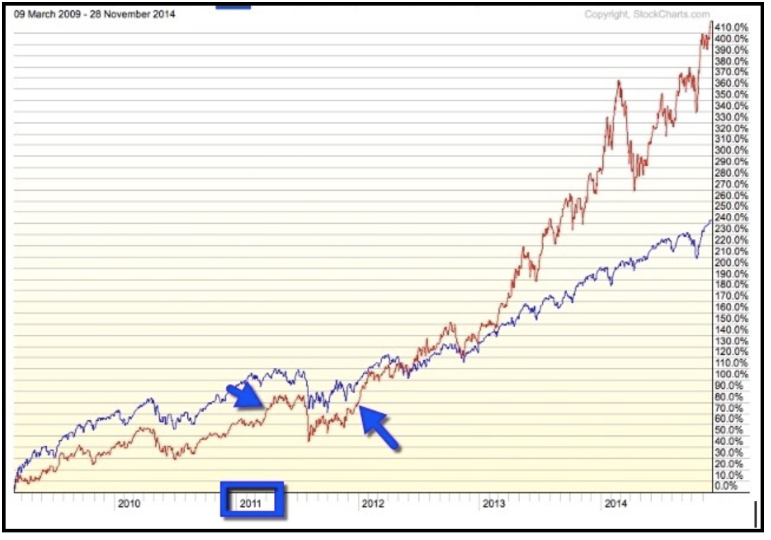
Using the relative strength chart, above, we can see a very big difference the third time IBB outperformed SPY in the short-term. This time, it made a new higher high (RS buy signal). This next RS chart, IBB versus SPY, dates from March 9, 2009 to November 28, 2014.
Here you can see what I meant when I said the chart doesn’t change. You can still see the same RS buy signal from the RS chart above, followed by a second RS buy signal.
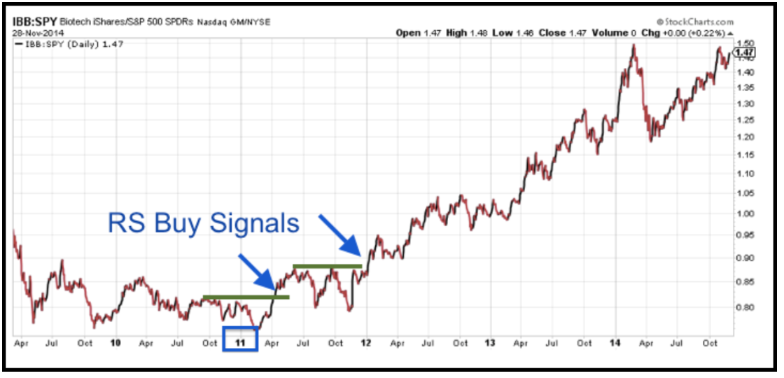
After the first RS buy signal, in April 2011, the chart seemed to trade in a sideways channel by making at least three highs that were higher than any of the highs set in 2010.
After the first RS buy signal, the more conservative investor may have decided to wait for more confirmation that IBB was, in fact, outperforming SPY. We saw that confirmation at the turn of the year from 2011 – 2012 when there was a second buy signal (higher high).
This chart serves as a good example of how relative strength relationships tend to trend, especially when it comes to sector relative strength. That’s one of the biggest benefits of relative strength investing – especially applying it to sectors as opposed to stocks.
Let’s compare the RS chart to the comparative performance chart.

As you can see (and as we mentioned earlier) because relative comparison charts only give us the absolute performance starting from and ending on a particular date, trying to figure out which security is stronger can be confusing.
Summing up the RS Chart
Feel exhausted? We’re almost home. And here’s a great way to think of the RS chart. Imagine a chart of your trading account performance when you take two positions at the same time using the same exact amount of money for each position.
For example: You buy $10,000 worth of IBB while you sell short $10,000 worth of SPY. (When you sell short, you are betting on the price declining. So, in this case, if SPY goes up by 10% then the SPY position actually loses 10% of it’s value – $1,000.)
If SPY goes down by 10%, then the SPY position actually gains 10% = $1,000.) So think of that particular RS chart as: owning IBB and shorting SPY. The RS chart would be identical to the chart of your account value, assuming you invested the exact same amount in the long IBB position as you invested in the short SPY position. If both advance, but IBB advances by more, then your overall account will be profitable. Although you’d lose money on the short SPY position, you’d make even more on the IBB position.
For example: IBB gains 15%: IBB position value is $11,500 SPY gains 10%: SPY position value is $9,000 Combined position value: $10,500 Relative strength chart: Advances If both decline, but IBB declines by less, then the account will still be profitable. Every day the account value may go up or down as IBB outperforms or underperforms SPY on a daily basis.
This causes short-term ups and downs on the RS chart. But over the long haul, if IBB’s short-term outperformances are more than IBB’s short-term underperformances, then you’ll have a chart (or account value) that is in a long-term uptrend. We have just gone over the power of relative performance and why it’s superior to comparative performance. We discussed how to check the relative strength of one security to another.
Not 100% confident in your understanding of relative strength? Just spend 30 seconds more to review how relative strength charts work.
The “Happy Recap”
The line on an RS chart will advance when security A outperforms security B. That is, the line will advance:
- When security A goes up by more than security B
- When security A goes down by less than security B
- When security A goes up while security B goes down
The line on an RS chart will decline when security A underperforms security B. That is, the line will decline:
- When security A goes down by more than security B
- When security A goes up by less than security B
- When security A goes down while security B goes up
If you made it this far – congratulations! I know that it takes something to wrap your head around relative strength. But I promise – the freedom, power and profit this approach provides could repay the effort a thousand times over.
As always, thanks for reading and trade safely.
Chris Rowe
If you have any questions or have been considering hiring an advisor, then schedule a free consultation with one of our advisors today. There’s no risk or obligation—let's just talk.
Tags

Free Guide: How to Find the Best Advisor for You
Get our absolutely free guide that covers different types of advisory services you'll encounter, differences between RIAs and broker-dealers, questions you’ll want to ask when interviewing advisors, and data any good financial advisor should know about you and your portfolio.
