
Related Blogs
July 22, 2021 | Michael Reilly
 Forget about whatever headlines have hit your inbox the last few days – delete them, all of them. They’re only distractions.
And in my opinion, they’ve never been more misleading than they are right now.
In fact, I was just explaining to my 11-year old son, Grady, that headlines do two things very well – they cause unnecessary stress and they sell ad-space. They do nothing to make you money.
I assure you that the little boy was very interested in his dad’s wise words and certainly didn’t roll his eyes and sigh.
I stopped short of showing him the charts I’m about to share with you.
Since you and I are much more concerned about our life savings, let’s check the charts…
CHART #1: NYSE ADVANCE-DECLINE LINE
Keep an eye on the New York Stock Exchange Advance/Decline line.
The Advance/Decline Line (AD Line) is the most basic breadth indicator there is. It is calculated by simply taking the difference between the number of stocks whose prices are rising, referred to as “advancing shares” and the number of stocks whose prices are falling, referred to as “declining shares”. The net result helps understand what direction most stocks that trade on the New York Stock Exchange are moving – up or down.
And as we can see in the chart below, more stocks are falling in price than rising in price. During strong stock markets, we expect to see the AD Line rising, as more and more stocks trade at higher prices, while in weakening markets we’d expect the AD Line to decline, as more and more stocks fall in price.
So here’s your headline: “In spite of recent volatility, the S&P 500 index is in striking distance of all-time highs”. Well, that’s exciting, said the investor!
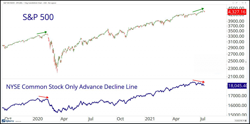
Here’s the reality: More stocks are falling in price right now than rising.
That’s a stark difference from the headline right? Not so fun is it? But it’s better to know the truth. And here’s the best part; now that you know, you won’t be surprised if stocks or the popular market averages fall in value temporarily.
In Technically parlance, what you see above is a classic “negative divergence” – in which the index’s move higher is not being confirmed by more stocks advancing than declining.
As Chris Rowe always says: “When the troops refuse to follow the Generals, trouble looms ahead”.
That’s why we’ve just raised an additional 10% cash from all of our clients’ equity (stock) models and we put on a strong hedge in all of our client’s investment models that allow for it.
We have some models that allow for us to add small position input options (which go up when the underlying security is going down).
And here’s something else you should probably know about this breadth indicator: not all declines in the popular stock market indices are preceded by a divergence in the A/D line.
However, almost EVERY divergence in the A/D line IS followed by some form of corrective action. So don’t overlook it, because we’re not.
CHART #2: CURRENCY PAIRS
The Aussie Dollar vs. Japanese Yen is a currency pairs ratio we’ll look to confirm the current risk appetite for stocks and other risk-on assets.
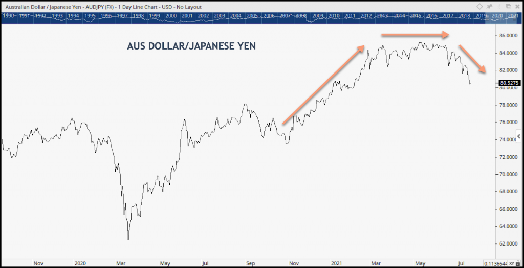
When the big boys are nervous about equity markets and want to get defensive, they’ll often hide out in the Yen.
That’s what they did in January and February of 2020 as COVID rocked equity markets, sending investors diving for cover.
But, when institutions feel confident and are looking for growth, they’ll shift gears and move the capital to the Aussie dollar (the risk-on trade) – that’s what they did after the March 2020 lows.
The Aussie Dollar held the advantage in this relative strength ratio until February of 2021, which coincided with the peak in prices (YTD). Coincidence? I don’t think so.
The AUD/JPY relationship flattened during the second quarter of this year, as markets chopped around for months. In June, the ratio reversed, favoring the safety of the Yen.
CHART #3: STOCKS VS. BONDS
This one is pretty straightforward- answering the question of which asset class (Stocks or Bonds) is stronger and may offer better relative performance. It’s a classic risk-on, risk-off analysis.
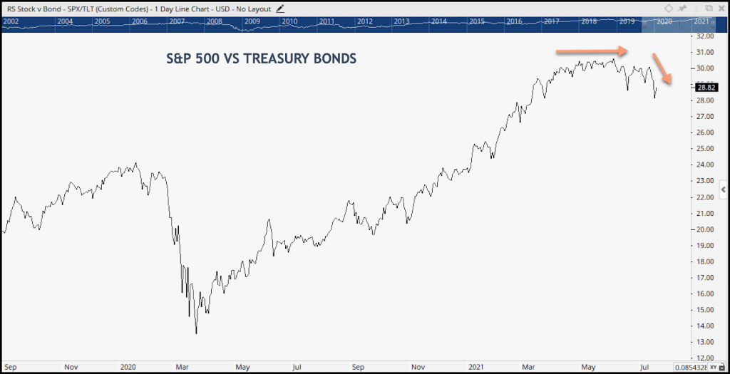
The rising line of the SPY: TLT ratio chart above shifted in favor of stocks at the covid lows (March ‘20), as Institutions smelled opportunity in the air.
Stocks held that momentum right up until Q2 when momentum waned and equity markets became more trendless, causing the ratio chart to flatten.
Over the last few months (far right of the chart) this relative strength relationship has shifted, favoring bonds over stocks – down arrow.
Bonds are stronger than stocks on a relative basis.
You wouldn’t have seen this weakness in stocks by watching the DJIA or S&P 500 index.
Chart #4: TREASURY PRICES CLIMBING
We’re watching the price of Treasuries. Treasury stocks are the ultimate form of protection to an alternative like stocks.
If bond prices are falling, money is moving out of the relative safety of bonds, often in favor of growth assets like stocks.
But, Treasury prices in both the 7-10 yr and 20 yr bonds have been catching a bid for months, but most investors are unaware.
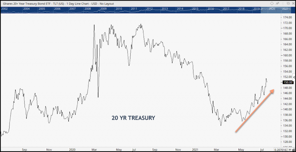
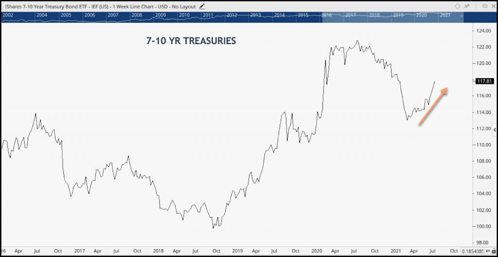
Investors should ask, “If Treasuries prices are rising – which is caused by renewed demand – how strong can equities really be (at least in the short term)”?
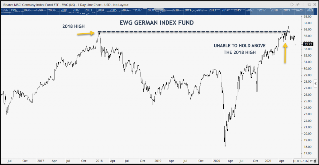
CHART#5 GLOBAL MARKETS:
Germany is the largest economy in Europe. I considered it the Mount Rushmore of European economies. If you want to know what’s happening with European stocks – the German DAX is a good place to start.
The index’s inability to stay above the previous 2018 high is not a strong endorsement for global equity markets right now.
Think about it… if the biggest market in Europe is rolling over, what are the implications for the rest of the developed markets in Europe.?
Since early June, the percentage of global markets trading above their 50-day moving average has fallen from the upper 80’s to just 20% now. And one-third of all markets are no longer even trading above their 200-day moving averages.
Under the surface, away from many of the more popular market indexes, there is very little in the way of positive breadth in equity markets today.
Here is something you should know about technical analysis. Not one of these ratio charts on their own is enough to form a valid market thesis.
Put them together and now It’s about the weight of the evidence.
Based on the six price and ratio charts we reviewed today, what we can say is this:
Stocks – Global stocks (risk assets) are consolidating and correcting through price. There’s selling under the surface, where index watchers can’t see.
How long will it last? How deep will the correction be? Nobody knows.
However, before panic sets in, let’s put that data into the context of the bigger picture – or the longer-term trend. As the saying goes “when in doubt, zoom out”.
The fact is, the longer-term trend strongly tilts in favor of growth assets.
U.S. Equities, Commodities, and International Equities are ranked #1,#2, and #3 respectively. These are the risk-on asset classes. Until there’s a major shake-up at the top, long-term growth remains the place to be.
What we are seeing today is normal and should be expected. Markets will be volatile from time to time. And the idea that we are experiencing some kind of short-term top is nothing to panic about. It’s a matter of awareness and ability to adapt to a changing market environment.
Tops, even short-term tops are a process, not an event. They don’t just show up one day regardless of how the media portrays it.
Savvy investors, who are paying attention to technical indicators, like the ones above are “in the know,” and have time to reallocate according to time frame and feelings about risk.
Thanks for reading. Be sure to check back next week to see what the technicals tell us!
Michael Reilly, CFP
Certified Financial Planner
PS: It’s that time of the year again. We are opening the doors to new investors who have investment portfolios valued over $500,000. Is your investment advisor giving you the professional service that you deserve? You can lock in your spot today if you’d like to schedule a free consultation with a risk management specialist at Rowe Wealth management. Click here to schedule a free consultation.
Through relative strength analysis, we uncover the strongest asset classes, sectors, and industry groups that are in uptrends and showing the potential for continued profits.
As an investor, your success and profits are often tied to your ability to adapt to ever-changing market conditions – and to the asset classes and sectors attracting the most institutional demand.
And that’s what Adapt Weekly has set out to do – to highlight market changes and give investors like you an edge, and the opportunity to profit tactically from what’s working and what’s not.
Tags

Get Our FREE Guide
How to Find the Best Advisor for You
Learn how to choose an advisor that has your best interests in mind. You'll also be subscribed to ADAPT, Avalon’s free newsletter with updates on our strongest performing investment models and market insights from a responsible money management perspective.
